Graphic Symbols of Valentine’s Day

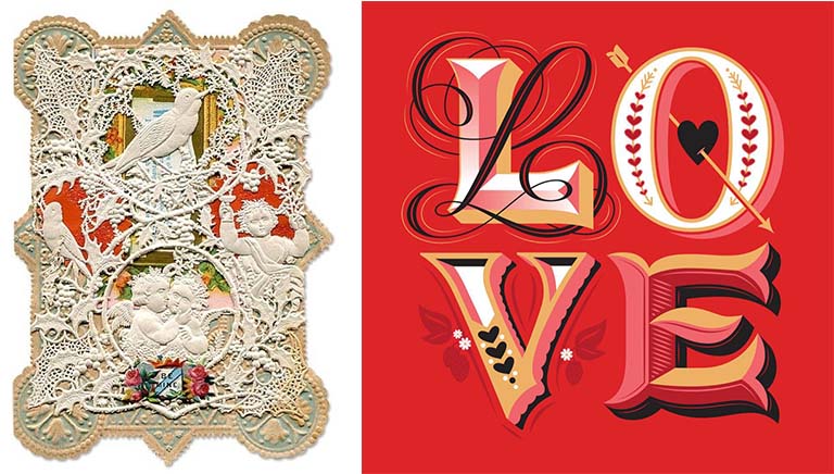
Love is in the air, and no one is more enthralled with Valentine’s Day than florists, chocolatiers, and greeting card vendors. Consider these Valentine’s Day statistics for the U.S. alone: 110 million roses are sold February 14, 58 billion pounds of chocolates, and 145 million Valentine’s Day cards. Named for St. Valentine who died on February 14 after being tortured and beheaded by a Roman Emperor, Valentine’s Day, in the romantic sense that as we think of it today, did not catch on until the Victorian era and owes much of its popular success to rapid advances in printing, paper and mass production technologies. Over the ages, Valentine’s Day evolved its own romantic ideographs – the color red, stylized heart shape, Cupid shooting arrows dipped in desire and erotic love, birds chirping to attract a mate, and typographic flourishes bursting with rapture. The Victorian card, on the left, is overlaid with a delicate doily that reveals embossed, die-cut printed images on the paper beneath. The contemporary card, on the right, designed by lettering artist Jessica Hische, expresses the exuberant complexity of love by the way the letterforms are drawn.

Happy Valentine’s Day.

Design Education

Run It Down the Flagpole If No One Salutes

City_Flags

Do you know if your city, town or suburb has an official flag? If your answer is no, you aren’t alone. This fascinating TED talk by digital storyteller Roman Mars is worth a listen and could prove helpful if you are ever asked to design a flag for your village or subdivision. As Mars points out, “City flags may be the worst-designed thing you’ve never noticed.”
Read More »

Typography

Revenge and Rescue on the Thames

This crime story has all the makings of a wonderful BBC Masterpiece Theatre episode. The real-life tale of passion for typography and revenge began in 1916 when an elderly gentleman walked onto London’s Hammersmith Bridge after midnight and began tossing tiny metal pieces of the font used exclusively by The Doves Press into the Thames River. This destruction of typographic art was perpetrated by printer/bookbinder, T.J. Cobden-Sanderson, to keep the font out of the hands of his former business partner, Emery Walker. Both leaders in the Arts and Crafts Movement, Cobden-Sanderson and Walker co-owned the renowned Doves Press, revered for creating exquisite fine arts books set in Doves type. In the contentious process of dissolving their business partnership in 1909, the two men fought bitterly over the rights to the Doves font. Rather than see Walker gain ownership, Cobden-Sanderson laid a plan to make sure that the font could never be used again. Over a period of about six months, the then 76-year-old Cobden-Sanderson set off each night under the cloak of darkness with bits of Doves font hidden in packets and pockets and surreptitiously sprinkled about a ton of the metal slugs and matrices onto the Thames. In all, he made about 170 trips from his bindery to the bridge to avoid arousing the suspicion of passersby.

In this short film by Tom Beal for BBC News Magazine, type designer Robert Green picks up the story a century later and recounts his obsession with recreating Doves accurately and his heroic effort to rescue the sunken metal type.


http://thames-capsule.co.uk/

Read More »

Design Communications

NYC Subway Graphic Standards Manual
Becomes Kickstarter Sensation

NYC_Subway_0

More than four decades have gone by since acclaimed designers Massimo Vignelli and Bob Noorda of Unimark International were hired by the New York Transit Authority (now the MTA) to modernize and unify the look of the subway signage, which by Noorda’s own account “was a mess.” Cluttered with varied typefaces of different sizes and rendered on different materials from mosaic tile to a paper sign stuck to the wall, the old signage system confused more than aided travelers. In its place, Vignelli and Noorda developed a cohesive subway wayfinding system designed to promote intuitive understanding — so much so that they promised: “The passenger will be given information or directions only at the point of decision. Never before. Never after.” It did all that and more. The New York Transit Authority’s wayfinding system is still considered a masterpiece of clarity, logic, consistency, and elegant modernist design.

The accompanying 174-page Graphic Standards Manual was as brilliantly written and produced by Vignelli and Noorda. One day in 2013, two young designers at Pentagram – Jesse Reed and Hamish Smyth – stumbled upon an original copy of the manual in the basement of Pentagram’s New York office. The pair found the manual so awesome that they wanted to share it with friends, so they created a dedicated website (thestandardsmanual.com) and posted scanned pages online. The site instantly went viral. Within 72 hours, more than a quarter million people visited the site. Although delighted, Reed and Smyth felt strongly that an on-screen viewing didn’t do justice to the beauty of the real Standards Manual. To truly appreciate it, they felt people should see it full size in print, and they set out to produce a book with an introduction by Vignelli protege and Pentagram partner Michael Bierut and an essay by New York Magazine’s Christopher Bonanos, author of “Instant: The Story of Polaroid”.

Read More »

Interviews

Business Strategy Behind Newell Rubbermaid’s New Design Center

Newell Rubbermaid’s new Design Center in Kalamazoo, Michigan, marks a monumental shift in the company’s design thinking and practices. This consolidation of design functions in a single location addresses how design in the 21st century has become a team activity that pulls in disciplines beyond design.

Chuck_Jones
In 2012, after Newell Rubbermaid adopted its Growth Game Plan strategy focused on four winning capabilities, including design and R&D, it brought in acclaimed designer Chuck Jones as its first Chief Design and Research & Development Officer to make the company more agile and responsive to consumers through design. Jones’ reputation preceded him, having successfully built global design and development teams that boosted sales and won awards for innovation at companies including Whirlpool and Xerox. Here, Jones talks about how Newell Rubbermaid is creating a brand-and-innovation-led company that is famous for design and product performance.
Read More »