Special Co-Branding

Oreo’s Homage to “Game of Thrones”

From upper left to lower right: House of Stark, the Night King, House of Targaryen, and House of Lannister

For the two or three people in the modern world who don’t know, Sunday April 14thmarks the start of the eighth and final season of “Game of Thrones” on HBO TV.   Based on the adaptation of “A Song of Ice and Fire” book by George R.R. Martin, “Game of Thrones” is a medieval fantasy epic that chronicles the violent dynastic struggles of noble families vying for the Iron throne in the Seven Kingdoms of Westeros.  The HBO series, created by David Benioff and D.B. Weiss, is predicted to attract more than one billion viewers worldwide in its final season. 

For the two or three people in the modern world who don’t know, Sunday April 14thmarks the start of the eighth and final season of “Game of Thrones” on HBO TV.   Based on the adaptation of “A Song of Ice and Fire” book by George R.R. Martin, “Game of Thrones” is a medieval fantasy epic that chronicles the violent dynastic struggles of noble families vying for the Iron throne in the Seven Kingdoms of Westeros.  The HBO series, created by David Benioff and D.B. Weiss, is predicted to attract more than one billion viewers worldwide in its final season. 

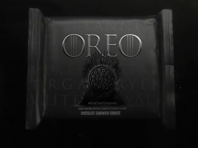
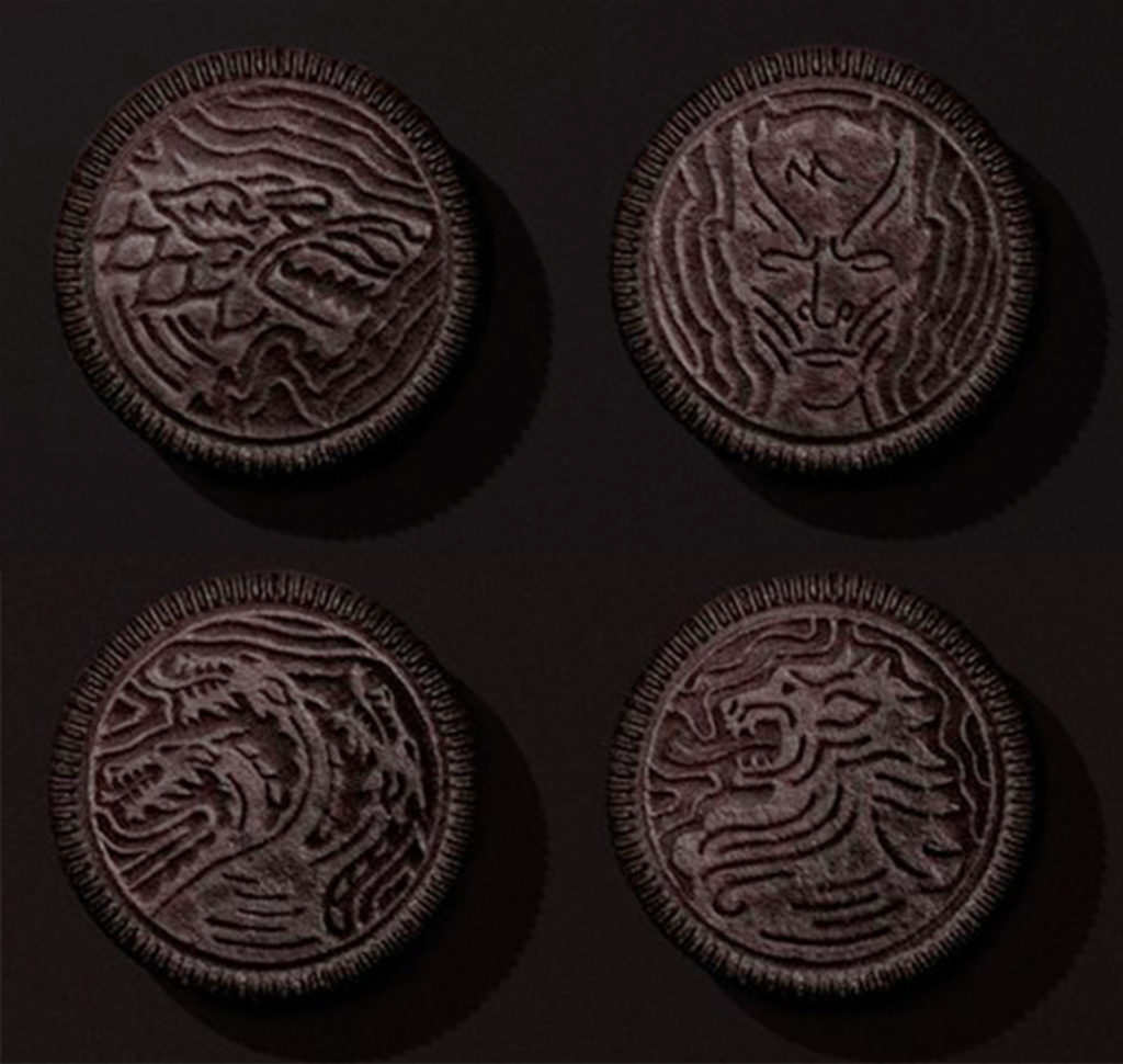
Season eight provided the perfect opportunity for Oreo to issue special edition cookies that would appeal to “Game of Thrones” fanatics. Instead of showing its brand as a friendly chocolatey snack, Oreo emphasized the stark black-and-white appearance of its cookies and stamped them with the crests of the fictional warring families. The packaging, too, showed the sinister-looking iron throne.  Oreo and HBO took this brand pairing a step further by teaming with Elastic Creative to substitute the show’s title sequence with a cookie-built version made entirely out of 2,750 Oreos.  The brand campaign is so imaginative that the limited edition offering is selling out as fans join in the fun of munching on “Game of Thrones”-themed snacks.

Oreo packaging with the Iron Throne
Motion Graphics

An A++ for Canal+ Advertising

We don’t know what the actual programming is like on the French premium cable channel Canal+ (meaning “channel plus more”) but if the entertainment value and production quality are half as good as its advertising, then sign us up. Made by French advertising agency BETC, the Canal+ commercials are engaging and fun. They are crafted like a feature film, no scrimping on budget here. The spots are cleverly conceived 60-second comedy sketches == worth searching on YouTube for other Canal+ commercials.
Read More »

Honda Stops Traffic with New Ad Campaign

This commercial for Honda does not promote its products as much as it highlights how its “Power of Dreams” philosophy has informed the brand’s approach to innovation and engineering over the years. The animated video, created by stop-motion filmmaker PES, uses sketches drawn on paper as a metaphor for the birth and development of ideas. Combining low-tech and high-tech skills, PES assigned multiple artists to hand draw and color thousands of illustrations and then shot the sketches in-camera to form a continuous “flip-paper” journey through Honda’s 60 year history, from founder Soichiro Honda’s use of a radio generator to power his wife’s bicycle, to the development of motorcycles and outboard motors, to today’s planes and automobiles. Reflecting the passage of time, the paper changes from yellowed fine line drawings to more colorful mechanical renderings. Even as the scenes change with ever-greater speed, the human hand plays a role in every frame. Very thoughtfully conceived and executed.
Read More »

Motion Graphics

Stop-Motion Visual Pun By PES

To get the humor in this visual pun by PES, the acclaimed motion graphics artist, it is best if you speak English. Sponsored by Lipton Iced Tea, the video centers around a homophone – meaning a word that sounds the same as another but has an entirely different meaning and spelling. Example: Flower and flour. In this case, PES based his pun around the homophone “mussel,” the shellfish that tastes great grilled and dipped in lemon and melted butter, and “muscle,” the body mass that men flex to flaunt how buff they are. It’s a clever visual pun, but only if the word for “mussel” and “muscle” are phonetically identical in your spoken language — otherwise, you’ll chuckle and wonder what that’s all about.