After El Paso and Dayton

Words When Pictures Fail

Cover Art via time.com

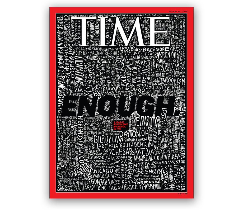
A constant struggle for editorial artists is the search for a way to capture the essence of a story in a single powerful image.  Unfortunately, picturing a semiautomatic assault weapon, as sinister as it looks, no longer shocks readers.  In fact, guns and even images of crying survivors of mass killings feel cynically banal.  That’s why this week’s Time Magazine cover stopped us in our tracks. San Francisco Bay Area artist John Mavroudis simply hand-lettered the 253 locations of mass shootings in America so far this year and added the word “ENOUGH.”  The crude lettering is crammed onto the page with city names shown vertically, sideways and at a slant in large letters and small, filling every nook and cranny. Mavroudis calls his drawing “a frightening portrait of a country drowning in gun violence.”  Indeed, the effect is chilling and memorable and gives perspective to our epidemic of domestic terrorism. 

Graphic Symbols of Valentine’s Day

Love is in the air, and no one is more enthralled with Valentine’s Day than florists, chocolatiers, and greeting card vendors. Consider these Valentine’s Day statistics for the U.S. alone: 110 million roses are sold February 14, 58 billion pounds of chocolates, and 145 million Valentine’s Day cards. Named for St. Valentine who died on February 14 after being tortured and beheaded by a Roman Emperor, Valentine’s Day, in the romantic sense that as we think of it today, did not catch on until the Victorian era and owes much of its popular success to rapid advances in printing, paper and mass production technologies. Over the ages, Valentine’s Day evolved its own romantic ideographs – the color red, stylized heart shape, Cupid shooting arrows dipped in desire and erotic love, birds chirping to attract a mate, and typographic flourishes bursting with rapture. The Victorian card, on the left, is overlaid with a delicate doily that reveals embossed, die-cut printed images on the paper beneath. The contemporary card, on the right, designed by lettering artist Jessica Hische, expresses the exuberant complexity of love by the way the letterforms are drawn.

Happy Valentine’s Day.

Publishing

Making of a Magazine Icon

With the exception of The New Yorker’s Victorian dandy, Eustace Tilley, American magazines haven’t had any memorable mascots. The haughty fop, peering at a butterfly through a monocle, debuted on the cover of The New Yorker’s very first issue in 1925. He was drawn by Rea Irvin, the magazine’s first art director. Irvin, who also designed the New Yorker’s distinctive font, based his illustration on an 1834 caricature of the notorious social gadfly, Count Alfred d’Orsay.

The New Yorker’s icon acquired the name, Eustace Tilley, from a series of tongue-in-cheek articles called “The Making of a Magazine: A Tour through the Vast Organization of The New Yorker,” written by Corey Ford in 1925. Ad buys were slim in The New Yorker’s early years (along with subscribers), and Ford’s humorous articles published in 20 installments were used to fill pages that advertisers weren’t buying. Ford named his fictional expert on magazine-making “Tilley” after his maiden aunt and “Eustace” because he thought it sounded good with Tilley. In time, Eustace Tilley and the top-hatted dandy on the cover of premiere issue became identified as one.

Read More »

Global Trends

Are You Fluent in Animal?

When I was a toddler, my grandmother, who spoke mostly Japanese, taught me how to mimic the sounds that dogs, cats and horses make. So imagine my confusion when my kindergarten teacher asked what a dog says, and I quickly raised my hand and said, “Wan, wan.” She shook her head and asked the class, “Does anyone else want to guess?” All of the other 5-year-olds yelled out, “Bow wow” and “woof woof.”

It was then that I realized that every culture has its own impression of how animals sound. As graphic communicators, we should be mindful of this when translating a book into another language. It’s not just words that differ; it’s how sounds are heard too. Manchester, UK- author James Chapman made this point in a charming illustrated book called Soundimals, presenting 19 animals “speaking” 32 different languages.

View James Chapman’s language based art on his Tumblr and purchase his work on his Etsy Store.

Read More »

Publishing

The Curse of “The Great Omar”

greatomar1

The luxurious but cursed Great Omar version of the “Rubáiyát of Omar Khayyám.”

There once was a time when bookbinding was a craft and an art form, not a mechanized process at the end of a press run. This tale of such bookbinding is fraught with the unrelenting pursuit of perfection, passion, tragedy, perseverance, and plain old rotten luck.

Our story begins in 1901 with the renowned British bookbinders Sangorski and Sutcliffe, who resurrected the Medieval art of binding books with intricately inlaid multicolored leather set with real gold, jewels, and gems. As fortune would have it, their services were sought out by Sotheran’s Bookshop in London, who asked them to create opulent binding for the “Rubaiyat of Omar Khayyam,” which soon became known as “The Great Omar.” The only instructions from Sotheran’s manager were that “it has to be the greatest example of bookbinding in the world…. put what you like into the binding, charge what you like for it, the greater the price, the more I shall be pleased; provided only that it is understood that what you do and what you charge will be justified by the result.” Read More »