Zero Waste Packaging

KFC Good for You, Good for the Earth

Some of us remember the time when our Japanese grandmothers would give us bite-size pieces of hard candy that we could pop in our mouths wrappers and all. The translucent “tissue” would easily dissolve because it was made out of rice paper.   Back then, it was a delightful novelty, but now it may be a solution for the mountains of packaging waste produced by fast-food chains. In Hong Kong, KFC is offering chicken sandwiches wrapped in edible rice paper and printed with edible ink.  It makes sense.  It cuts down on litter.  It’s a tidy way to eat fried chicken without dropping greasy crumbs all over.  And it is still “finger lickin’ good.”

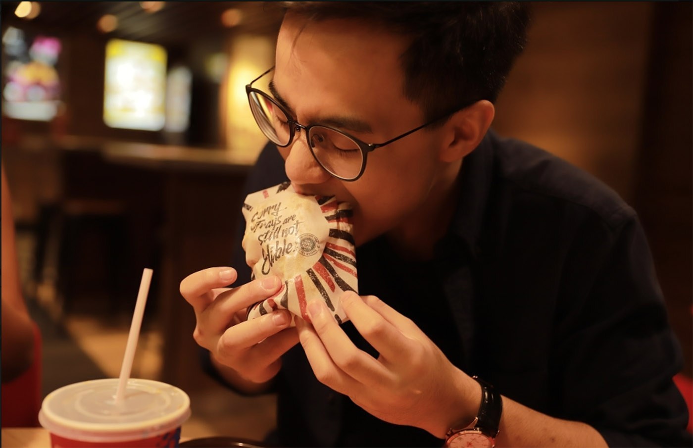
Designed by Ogilvy & Mather Group Hong Kong, the edible wrapper was created to pair with KFC’s bunless Double Down sandwich, which features two pieces of fried chicken in place of bread.  If you eat every last bite, you are responsibly contributing to the Zero Waste Movement.

Read More »

Political branding system

Candidate Pete Buttigieg Unveils Multi-colored Campaign Palette

This isn’t an endorsement of candidate Pete Buttigieg’s campaign for President (we try to keep our blog apolitical), but it is a vote for Mayor Pete’s well-conceived graphic identity system. Brooklyn-based design firm, Hyperakt, created the campaign branding program, opting to skip Pete’s last name since most people can’t pronounce, much less spell, “Buttigieg.” (It is roughly pronounced “Boot Edge Edge.”) The logo is in the shape of the historic arched bridge in South Bend, Indiana, where Pete has been mayor for the past eight years, and frames his name within brackets of 2020. Not the usual red white and blue patriotic colors, however, the official campaign palette is made up of nine non-primary colors that represent things that are personally meaningful to the candidate, like the two browns that are the color of Pete’s dogs, Buddy and Truman, and the shades of Midwestern cornfields, industrial buildings and sports team. The branding system also uses a wide range of typefaces to individualize the look for each state. To make it easy for supporters to develop campaign materials without much hassle the campaign’s graphic standards are posted online and are fully scaleable and downloadable.

Logo Quiz

Earth Day 2019

Have you done something nice for your planet today?   It’s Earth Day.

Since the first Earth Day was celebrated in 1970, many positive environmental protection victories have occurred.  We have phased out cancer-causing asbestos, took the lead out of gasoline, banned toxic DDT and PCBs, cleaned up waterways enough so that rivers don’t spontaneously burst into flames, made progress plugging the ozone hole, saved the bald eagle and the black-footed ferret from extinction, instituted measures to design “green” buildings, among other positive achievements.  

Despite these noteworthy improvements, the earth is not in the clear.  Human use of fossil fuels have largely caused carbon dioxide levels to rise by 46 percent in the last century.  Higher atmospheric temperatures are causing the polar ice cap to melt and sea levels to rise. The earth’s glaciers are losing up to 390 billion tons of ice and snow a year.  Nearly 100 billion plastic bags are used in America every year. The world’s scientists say that there is a 99.9999% chance that humans are the cause of climate change. 

Many industry watchdog agencies are taking action and certifying products and companies that follow responsible environmental practices, acknowledged their efforts by giving them the right to display “seal of approval” labels on their products. Today there are literally hundreds of green product certification labels in the U.S. alone. This little quiz challenges your knowledge of a few of them.

Read More »

Special Co-Branding

Oreo’s Homage to “Game of Thrones”

From upper left to lower right: House of Stark, the Night King, House of Targaryen, and House of Lannister

For the two or three people in the modern world who don’t know, Sunday April 14thmarks the start of the eighth and final season of “Game of Thrones” on HBO TV.   Based on the adaptation of “A Song of Ice and Fire” book by George R.R. Martin, “Game of Thrones” is a medieval fantasy epic that chronicles the violent dynastic struggles of noble families vying for the Iron throne in the Seven Kingdoms of Westeros.  The HBO series, created by David Benioff and D.B. Weiss, is predicted to attract more than one billion viewers worldwide in its final season. 

For the two or three people in the modern world who don’t know, Sunday April 14thmarks the start of the eighth and final season of “Game of Thrones” on HBO TV.   Based on the adaptation of “A Song of Ice and Fire” book by George R.R. Martin, “Game of Thrones” is a medieval fantasy epic that chronicles the violent dynastic struggles of noble families vying for the Iron throne in the Seven Kingdoms of Westeros.  The HBO series, created by David Benioff and D.B. Weiss, is predicted to attract more than one billion viewers worldwide in its final season. 

Season eight provided the perfect opportunity for Oreo to issue special edition cookies that would appeal to “Game of Thrones” fanatics. Instead of showing its brand as a friendly chocolatey snack, Oreo emphasized the stark black-and-white appearance of its cookies and stamped them with the crests of the fictional warring families. The packaging, too, showed the sinister-looking iron throne.  Oreo and HBO took this brand pairing a step further by teaming with Elastic Creative to substitute the show’s title sequence with a cookie-built version made entirely out of 2,750 Oreos.  The brand campaign is so imaginative that the limited edition offering is selling out as fans join in the fun of munching on “Game of Thrones”-themed snacks.

Oreo packaging with the Iron Throne
Environmental Awareness

Plastikophobia Art Installation

Plastikophobia is a new immersive art installation in Singapore made from 18,000 single-use plastic cups collected from local food markets  to raise public awareness of plastic pollution.  Although beautiful to look at, this art piece is in no way an endorsement to use more plastic.

The art project started when Canadian photographer Benjamin Von Wong and Joshua Goh at the National University of Singapore teamed up with social impact strategist Laura Francois to create an exhibition for the Sustainable Singapore Gallery.  Knowing that Singapore recycled less than 6% of its plastic waste, the team set out to draw attention to plastic pollution by making an art installation from discarded plastic cups.  In a short time, they managed to collect thousands of single-use cups from local merchants and recruited hundreds of volunteers to bring the project to life.  The end result is surreal and lovely, and hopefully disturbing.

In Singapore, plastic waste is reaching crisis proportions.  According to the Singapore Straits Time, plastic waste has increased sevenfold since the 1970s.  The average Singaporean uses and discards about 13 plastic bags a day.  The statistics are equally daunting in other parts of the world.   Studies show that 91% of plastic worldwide does not get recycled.  The toxic chemicals that leach out of plastic have had an alarming impact on the environment and all of its inhabitants.

Like Singapore, other parts of the world are awakening to the harmful effect of plastic. Just last week the EU Parliament banned single-use plastics by 2021.  It’s not just the proliferation of unsightly litter; it’s the toxins that are slowly killing us.  A solution must start with product and packaging designers who have made plastic their favorite “go to” material.

The Plastikophobia exhibit is showing at the Sustainable Singapore Gallery until April 18th.

https://plastikophobia.com