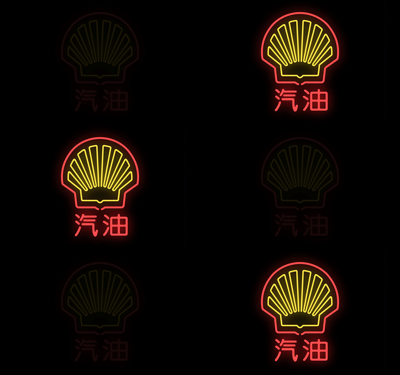
Through the use of neon signs, Mehmet Gözetlik, Istanbul-based art director of Antrepo design agency, demonstrated how 20 of the best-known Western brands might be translated into Chinese.
In an interview with the International Business Times, Gözetlik pointed out that China is now the world’s largest economy and has a current population of 1.35 billion people. Yet, he adds, foreign companies take a literal and phonetic approach to presenting their brand, instead of considering how the logo translates visually and culturally. “Most of today’s Western brand identities are created by Western design companies, based on Western culture. It means we have two separated worlds, because of our DNA. So, there is more misunderstanding than we thought. We don’t actually understand many things we assume that are understood. We are like a person who misses the view while reading on the train. We are not aware of where we are coming from, going to or passing by,” Gözetlik said.

Gözetlik’s “Chinatown” project explores how Western trademarks can be presented for the Chinese culture. On the signage examples, he maintained the graphic identity known to consumers around the world, but described the company’s product in Chinese characters – e.g., the Starbucks signage reads “Caramel Macchiato”; Shell Oil reads “gasoline”, etc.
Gözetlik says that “Chinatown” reflects the branded world of the near future. “Sooner or later, most major global brands will obviously need to adjust their meaning based on translation to demonstrate alignment with local Chinese culture and tastes. And most certainly they will collapse when the time comes, due to their existing brand structure that is built on western culture and Latin words.”
