In Memoriam

Milton Glaser: For Love of Design

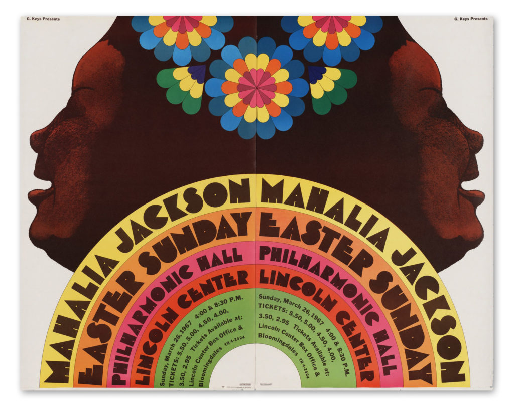
Designer Milton Glaser, who passed this week on his 91st birthday, left a body of work that transcends the decades.  His “I love NY” logo, psychedelic Dylan poster, and Mahalia Jackson album cover will forever remain part of our cultural iconography.  

His love of design remained strong to his final days. For Milton, design wasn’t a profession or merely a means to accrue wealth and fame.  It was a process of observing, learning, communicating core ideas.  It is fitting that the last piece that he was working on when he passed was a graphical treatment of the word “Together” to encourage the public struggling through the covid 19 pandemic.  

Read More »
Publishing

Making of a Magazine Icon

With the exception of The New Yorker’s Victorian dandy, Eustace Tilley, American magazines haven’t had any memorable mascots. The haughty fop, peering at a butterfly through a monocle, debuted on the cover of The New Yorker’s very first issue in 1925. He was drawn by Rea Irvin, the magazine’s first art director. Irvin, who also designed the New Yorker’s distinctive font, based his illustration on an 1834 caricature of the notorious social gadfly, Count Alfred d’Orsay.

The New Yorker’s icon acquired the name, Eustace Tilley, from a series of tongue-in-cheek articles called “The Making of a Magazine: A Tour through the Vast Organization of The New Yorker,” written by Corey Ford in 1925. Ad buys were slim in The New Yorker’s early years (along with subscribers), and Ford’s humorous articles published in 20 installments were used to fill pages that advertisers weren’t buying. Ford named his fictional expert on magazine-making “Tilley” after his maiden aunt and “Eustace” because he thought it sounded good with Tilley. In time, Eustace Tilley and the top-hatted dandy on the cover of premiere issue became identified as one.

Read More »

Quizzes

Fourth of July Quiz

P6-7new

The flag gate, above, was created for the 1876 American Centennial, and is now housed in the American Folk Art Museum in New York.

In honor of America’s Independence Day, also know as the Fourth of July, we have created a brief quiz to test your knowledge of Stars & Stripes history. For those of our readers not based in the U.S., we will handicap you two free answers. Good luck! Happy Fourth.

1. Who designed the American flag?
a. George Washington
b. Betsy Ross
c. Thomas Jefferson
d. Francis Hopkinson

2. The Star Spangled Banner, America’s most famous flag, has how many stars and stripes?

a. 13 stars and 13 stripes
b. 15 stars and 13 Stripes
c. 15 stars and 15 stripes
d. 18 stars and 13 stripes

3. What year was the Stars and Stripes adopted by Congress?

a. 1775
b. 1776
c. 1777
c. 1778

4. Is it illegal to burn the American flag?

a. Yes
b. No
c. On occasion

5. On what date are new stars added to the flag?

a. January 1, after a states’ admission to the Union
b. June 14, after a states’ admission to the Union
c. July 4, after a states’ admission to the Union

6. How many stars are on the flag that has flown the longest over the United States?

a. 48 stars
b. 36 stars
c. 50 stars
c. 13 stars


Answers below…
Read More »

Typography

Revenge and Rescue on the Thames

This crime story has all the makings of a wonderful BBC Masterpiece Theatre episode. The real-life tale of passion for typography and revenge began in 1916 when an elderly gentleman walked onto London’s Hammersmith Bridge after midnight and began tossing tiny metal pieces of the font used exclusively by The Doves Press into the Thames River. This destruction of typographic art was perpetrated by printer/bookbinder, T.J. Cobden-Sanderson, to keep the font out of the hands of his former business partner, Emery Walker. Both leaders in the Arts and Crafts Movement, Cobden-Sanderson and Walker co-owned the renowned Doves Press, revered for creating exquisite fine arts books set in Doves type. In the contentious process of dissolving their business partnership in 1909, the two men fought bitterly over the rights to the Doves font. Rather than see Walker gain ownership, Cobden-Sanderson laid a plan to make sure that the font could never be used again. Over a period of about six months, the then 76-year-old Cobden-Sanderson set off each night under the cloak of darkness with bits of Doves font hidden in packets and pockets and surreptitiously sprinkled about a ton of the metal slugs and matrices onto the Thames. In all, he made about 170 trips from his bindery to the bridge to avoid arousing the suspicion of passersby.

In this short film by Tom Beal for BBC News Magazine, type designer Robert Green picks up the story a century later and recounts his obsession with recreating Doves accurately and his heroic effort to rescue the sunken metal type.


http://thames-capsule.co.uk/

Read More »