Candidate Pete Buttigieg Unveils Multi-colored Campaign Palette
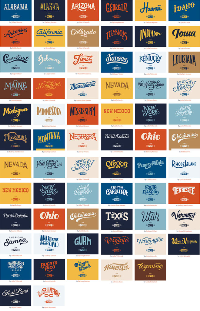
This isn’t an endorsement of candidate Pete Buttigieg’s campaign for President (we try to keep our blog apolitical), but it is a vote for Mayor Pete’s well-conceived graphic identity system. Brooklyn-based design firm, Hyperakt, created the campaign branding program, opting to skip Pete’s last name since most people can’t pronounce, much less spell, “Buttigieg.” (It is roughly pronounced “Boot Edge Edge.”) The logo is in the shape of the historic arched bridge in South Bend, Indiana, where Pete has been mayor for the past eight years, and frames his name within brackets of 2020. Not the usual red white and blue patriotic colors, however, the official campaign palette is made up of nine non-primary colors that represent things that are personally meaningful to the candidate, like the two browns that are the color of Pete’s dogs, Buddy and Truman, and the shades of Midwestern cornfields, industrial buildings and sports team. The branding system also uses a wide range of typefaces to individualize the look for each state. To make it easy for supporters to develop campaign materials without much hassle the campaign’s graphic standards are posted online and are fully scaleable and downloadable.


