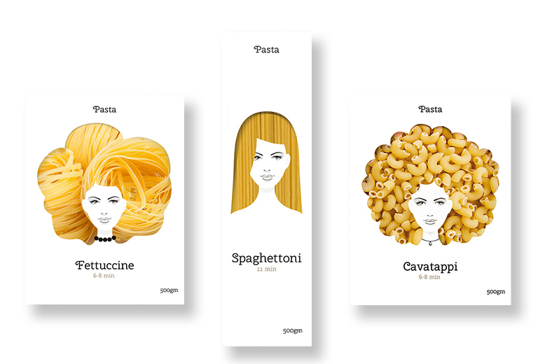
Why try to describe the product with images and words, when you can die-cut the package and give shoppers a peek inside? Especially when it comes to pasta noodles, it is helpful to see what the actual noodles look like instead of trying to recall the difference between fettuccine, rigatoni, vermicelli, macaroni, etc. This concept packaging by Moscow-based designer Nikita Konkin used the different shapes and textures of pasta noodles to create silhouettes of fanciful hairstyles in the die-cut windows. The noodle hairstyles framed a simple one-color line drawing of a woman’s face in a memorable and playful way.
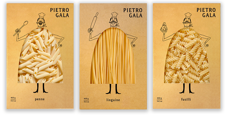 Fresh Chicken branding agency in Russia created the identity and packaging for Pietro Gala, a new hand-crafted premium pasta brand. In addition to creating the rotund Italian chef icon named Pietro Gala, Fresh Chicken developed die-cut packaging that previewed the product inside. Packaged in unbleached paperboard and printed in a single color, the design is meant to emphasize the naturalness of the product.
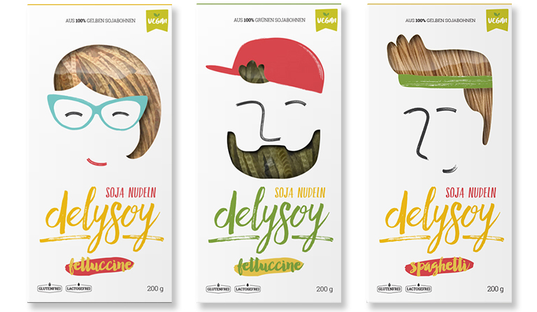 Delysoy commissioned Bunker agency from Bosnia-Herzegovina to create a playful eye-catching series of six packaging boxes for its all-natural pasta brand. Made from 100 percent soybean, Delysoy pastas are gluten-free, lactose-free, low-carb, and protein and vitamin rich. Even the yellow, black and green colors of the noodles are the true natural shade of the types of soybeans used. Recognizing that the most likely customers would be young, hip, health-conscious millennials receptive to new culinary thrills, Bunker targeted Delysoy’s brand message to them. The packages feature caricatures of prospective customers with facial hair, backward baseball caps, earphones. and workout sweatbands. The noodles, in different colors, are visible through cutout windows shaped like the hair of the characters.