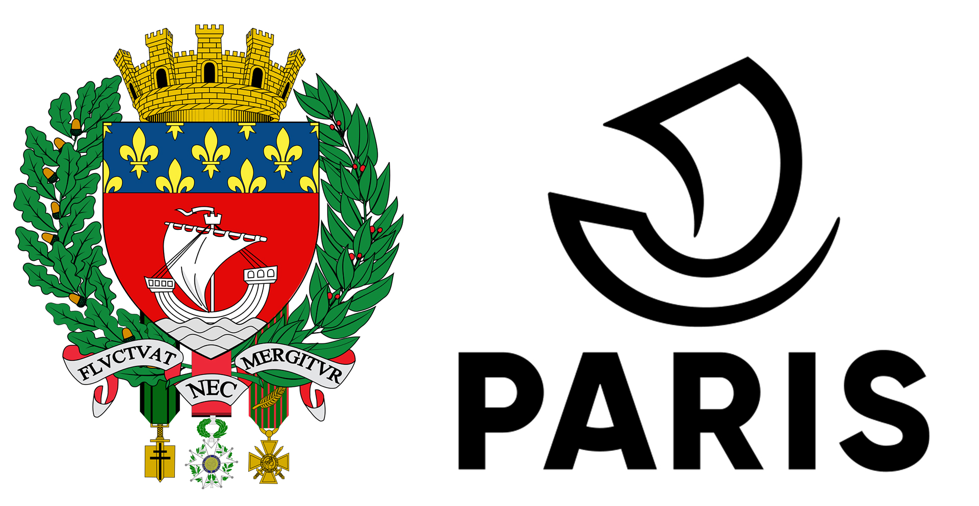
Ask people to name some of the most iconic symbols of Paris and they are likely to say the Eiffel Tower, Arc de Triomphe, the Louvre, the Notre Dame Cathedral, among other landmarks. What they are unlikely to mention are the merchant boats that once plied the Seine. So important were these vessels to the survival, wealth and influence of Paris in the Middle Ages, a high-sided boat with a billowing sail was adopted as the heraldic coat of arms for Paris in 1358. It remained the city’s official emblem for more than a thousand years. The seal is typically displayed on public facilities along with the city motto “Fluctuat nec Mergitur” – Latin for “tossed upon the waves, but doesn’t sink.”
Over the centuries, the boat displayed on the coat of arms had been redesigned a dozen or so times, with artists striving for a more majestic look, sometimes by drawing tall-clipper-type ships with multiple masts. But in 1942, when Paris again modified its logo, it aimed for more historical accuracy and showed a high-sided, bowed gondola-like boat with a single mast. That version remained the authorized logo for Paris, until the city opted to modernize it to complement the graphic style of today.


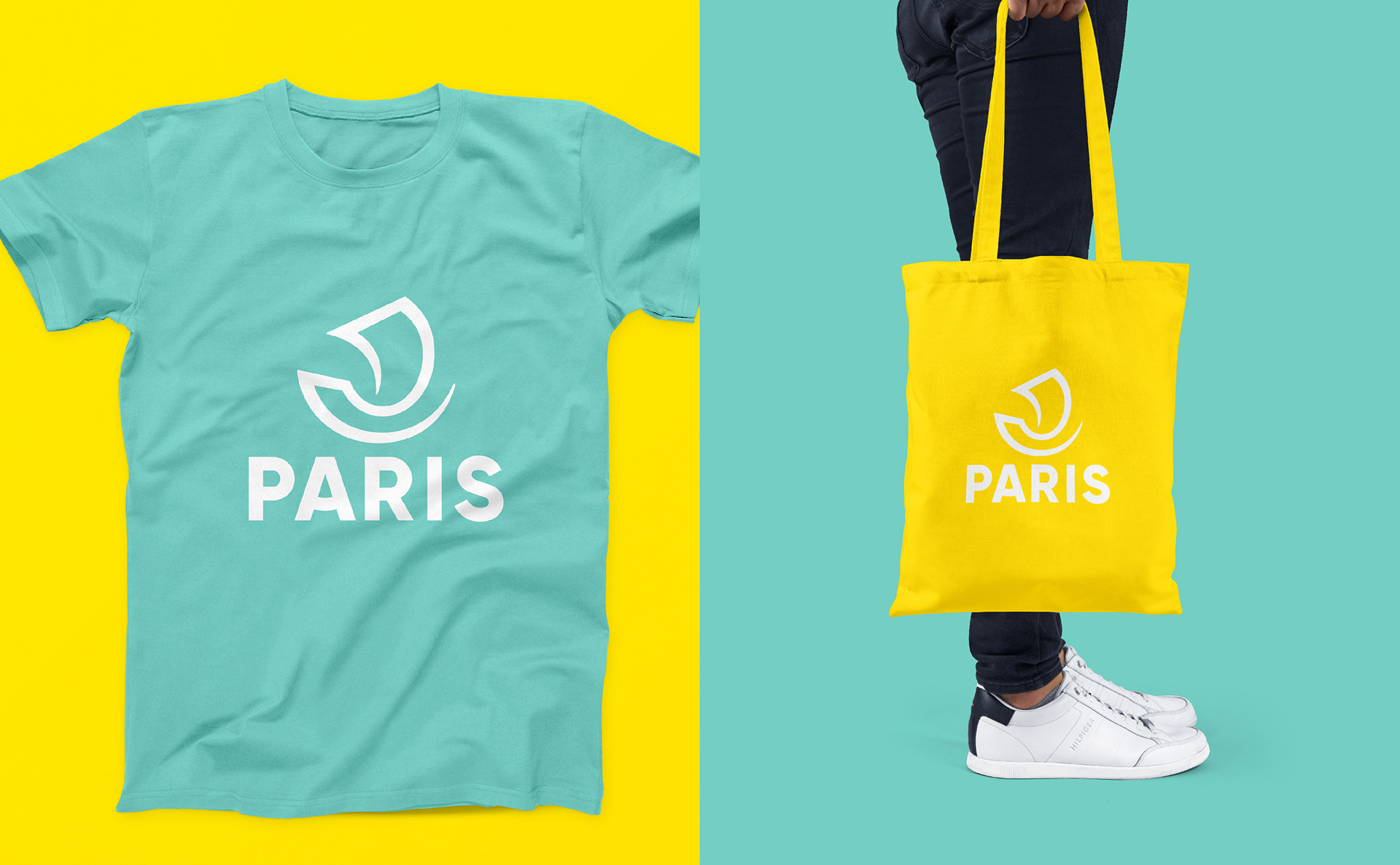
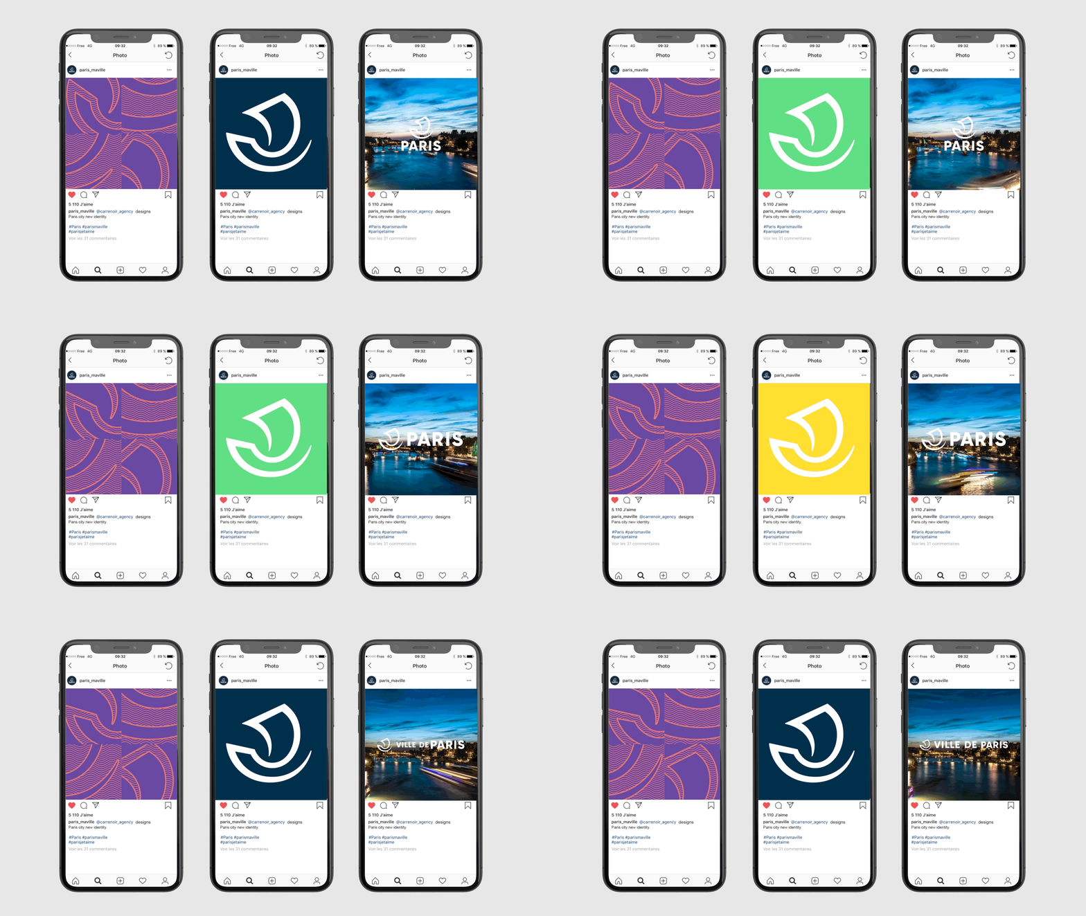
Paris-based branding agency, Carre Noir, was commissioned to create a new mark that retained the historical nave as its municipal symbol yet could be displayed comfortably on everything from smartphones and T-shirts to billboards, and could be used in digital and modular formats and in a variety of colors and graphic styles.
Working on iPads using the Procreate app, Carre Noir creatives sketched dozens of iterations of the boat before capturing the shape in a single bold stroke. The elegantly simple calligraphy-like shape suggested both movement, confidence and stability. Monserrat in all caps was chosen for the logotype, with a slight adjustment to the “A” to echo the curve of the boat. Far removed from the fussy medieval coat of arms, the sleek new Paris logo has the versatility and style to look good in any format and surface.
