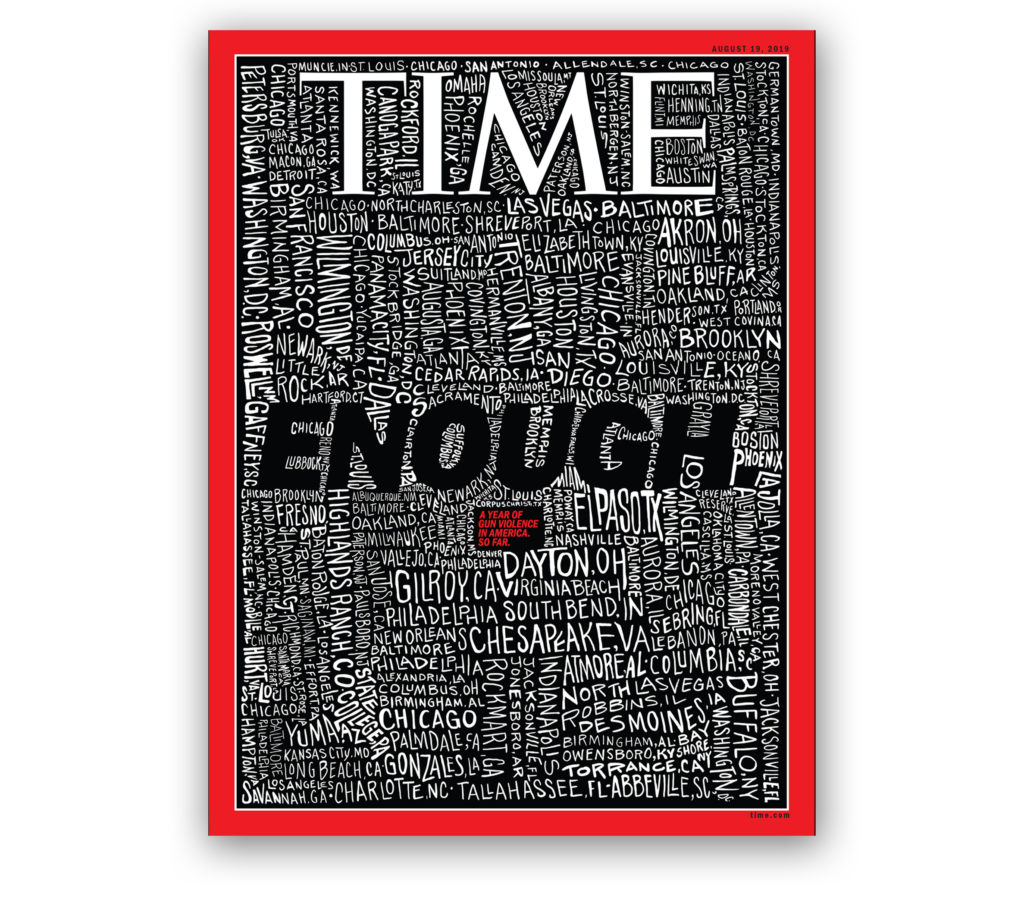
A constant struggle for editorial artists is the search for a way to capture the essence of a story in a single powerful image. Unfortunately, picturing a semiautomatic assault weapon, as sinister as it looks, no longer shocks readers. In fact, guns and even images of crying survivors of mass killings feel cynically banal. That’s why this week’s Time Magazine cover stopped us in our tracks. San Francisco Bay Area artist John Mavroudis simply hand-lettered the 253 locations of mass shootings in America so far this year and added the word “ENOUGH.” The crude lettering is crammed onto the page with city names shown vertically, sideways and at a slant in large letters and small, filling every nook and cranny. Mavroudis calls his drawing “a frightening portrait of a country drowning in gun violence.” Indeed, the effect is chilling and memorable and gives perspective to our epidemic of domestic terrorism.
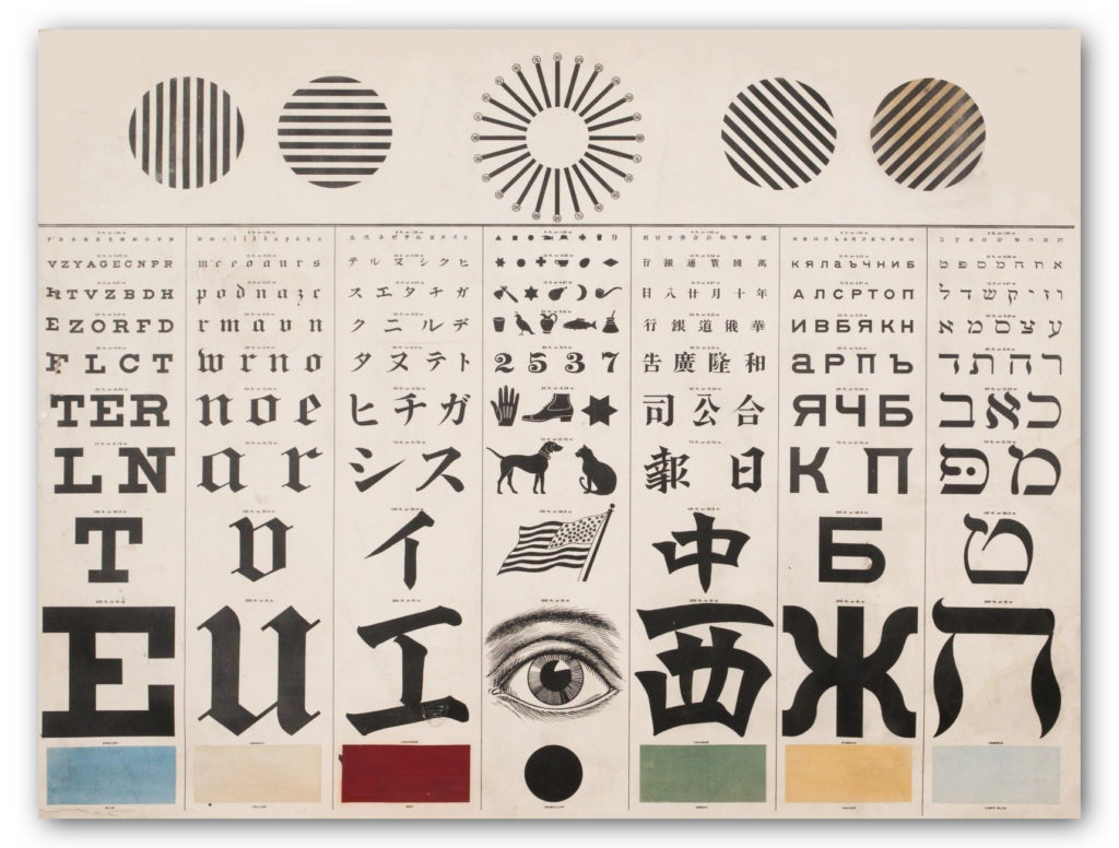
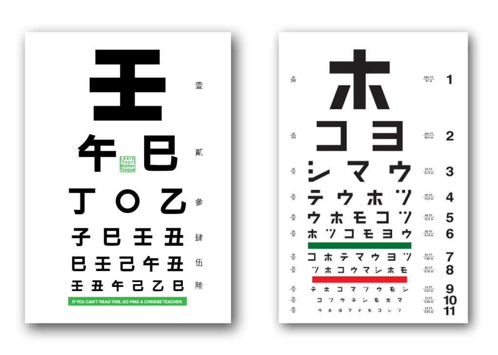
George Mayerle’s Eye Chart in Roman, Hebrew and Chinese
Designers are a trend-conscious lot when it comes to typography. They like to keep up with the latest edgy typefaces, and will opine endlessly over the historical contributions of Baskerville and Caslon, discuss the attitude evoked by various faces, and when too much kerning or letter spacing makes words illegible… yada, yada, yada, yawn.
Forget all that. Your design-centric pontificating doesn’t matter when it comes to the best typeface for eye exam charts.
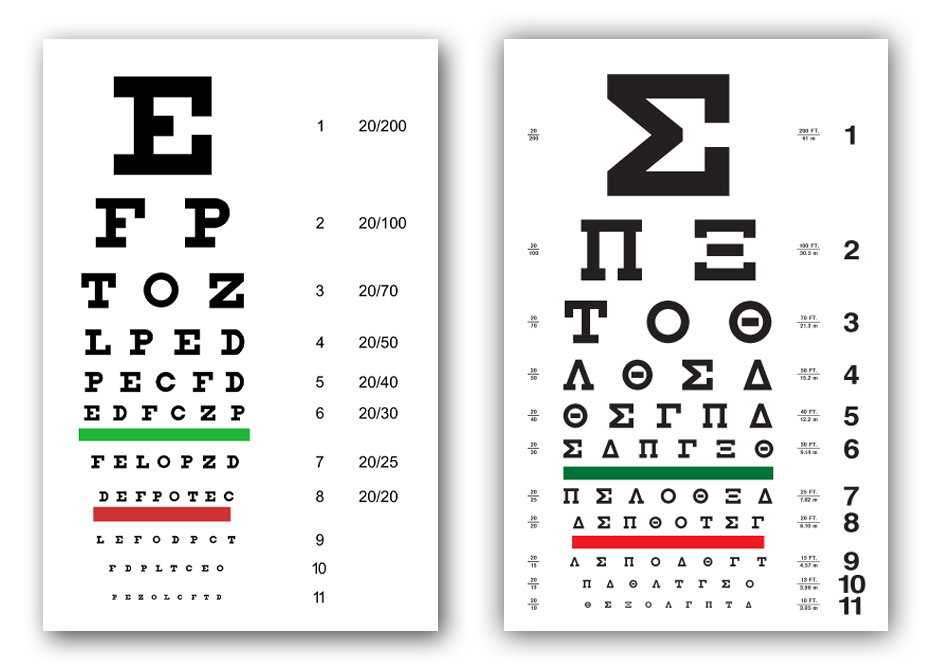
English Eye Chart, Left and Greek Eye Chart, Right
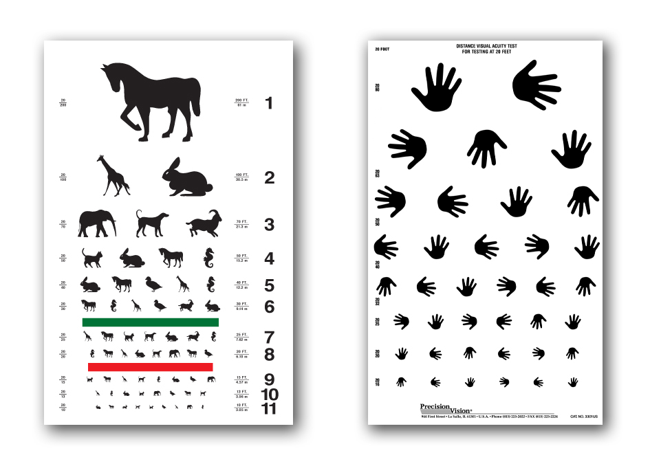
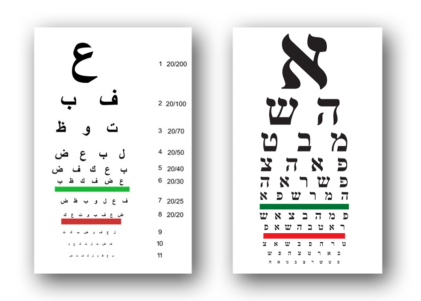
Eye exam charts are not designed to be elegant or trendy. They are based on medical science and geometric measurements. We can’t speak for how “optotype” is rendered in Chinese or Hebrew, but the letters on the English charts are all caps with no thicks or thins in the letterforms. The same principles undoubtedly apply in other language eye charts as well. In the case of children and people who can’t read, eye charts test the ability to recognize familiar animals and the direction a hand is pointing.
Dutch eye doctor Hermann Snellen developed the now famous Snellen eye chart in 1862 by asking patients to cover one eye and read letterforms on a 5×5 grid, while standing 20 feet (or 6 meters away). The optotype is based on simple geometry in which the thickness of the lines equals the thickness of the white spaces between lines and the thickness of the gap in the letter “C”. The height and width of the type must be five times the thickness of the line.
Animal and Hand Direction Eye Charts for Children
Chinese Eye Chart, Left and Japanese Eye Chart, Right
Arabic Eye Chart, Left and Hebrew Eye Chart, Right
The common Snellen chart uses only ten letters C, D, E, F, L, N, O, P, T, Z. The British Standards Institution specifies twelve letters — C, D, E, F, H, K, N, P, R, U, V, Z — based on the equal legibility of the letters. It also requires uniform luminance. Visual acuity tests in doctor’s offices use the same eye charts, but exams for a motor vehicle license randomize letters so vision impaired motorists can’t cheat by memorizing the sequence of letters on the chart.
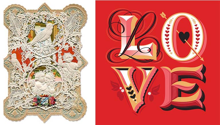
Love is in the air, and no one is more enthralled with Valentine’s Day than florists, chocolatiers, and greeting card vendors. Consider these Valentine’s Day statistics for the U.S. alone: 110 million roses are sold February 14, 58 billion pounds of chocolates, and 145 million Valentine’s Day cards. Named for St. Valentine who died on February 14 after being tortured and beheaded by a Roman Emperor, Valentine’s Day, in the romantic sense that as we think of it today, did not catch on until the Victorian era and owes much of its popular success to rapid advances in printing, paper and mass production technologies. Over the ages, Valentine’s Day evolved its own romantic ideographs – the color red, stylized heart shape, Cupid shooting arrows dipped in desire and erotic love, birds chirping to attract a mate, and typographic flourishes bursting with rapture. The Victorian card, on the left, is overlaid with a delicate doily that reveals embossed, die-cut printed images on the paper beneath. The contemporary card, on the right, designed by lettering artist Jessica Hische, expresses the exuberant complexity of love by the way the letterforms are drawn.
Setting a film title in the font Trajan is a can’t-go-wrong choice.–cheaper than commissioning a titling face from scratch and not as mundane as picking Helvetica or Times Roman. Typewise, it is the equivalent of the “little black dress” that fashion magazines tell us should be in every woman’s closet for special social occasions. Whether the film titling is for a comedy, romance or thriller, Trajan is refreshingly appealing and appropriate.
A serif all-caps typeface designed in 1989 by Carol Twombly for Adobe, Trajan is based on the letterforms carved into the Trajan’s Column in Rome in AD113. The classical Roman letterforms actually predate the inscription on the Trajan’s Column, and first appeared in 43 BC, making it the world’s oldest typeface. Twombly’s crisp and faithful digitalization of Trajan has given it new life, and has become the ubiquitous font for the film industry. This video on Trajan was produced by Vox and designer/ typography blogger Yves Peters.
When people think of becoming a designer, they usually think of print graphics, industrial, digital, environmental, interior, software, etc., but design encompasses a lot more territory than that and has many subsets. This is an interview with Dublin-based designer Annie Atkins who specializes in creating authentic-looking props and graphics for such films as Wes Anderson’s The Grand Budapest Hotel. Here, Atkins talks about her craft and the importance of paying attention to seemingly insignificant details.