Coronavirus on Earth Day

Giving Thanks on Earth Day
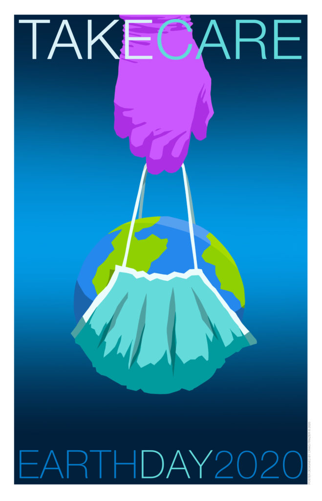
Poster Designed by Craig Frazier

April 22nd marks the 50th anniversary of Earth Day, which most years focuses on how mankind is endangering the environment and the creatures that inhabit the earth.  This year illustrator Craig Frazier created a poignant reminder that humans are also an interconnected part of this ecosystem. With the coronavirus pandemic threatening our very existence, it behooves us to remember that we are all part of one earth.  Explaining how he arrived at this year’s Earth Day theme, Craig said, “At this time, we need to take care of those who are taking care of us all over the world.  I designed this poster to honor the health care workers who are doing the heavy lifting.”   Indeed. 

Write Winning Resumes

Writing a Design Resume

Writing a resume for a job in a design studio is different than applying for a corporate manager position. Aside from wanting to know the usual list of previous employment and education, design employers look for clues that the applicant has the skills that designers need and will fit compatibly on the design team.  It’s not just what you say, but how you present it.  

Here are 10 tips on preparing a resume that works:

1. Do your homework first.

Check out the design studio’s website and do a google search to look at the firm’s design style, past projects, industry recognition, staffing, philosophy, etc.   This will reveal a lot about whether you are a good fit for the studio, and vice versa.

2. Include a Cover Letter

Include a brief cover letter with your resume, even if you are sending an unsolicited application or responding to an online job posting. A personalized letter is not only polite, it indicates that you specifically want to work there, and are not blanketing the entire design world with your resume.  If you have been referred by someone known to the firm, include that too.

3. Tell Them Where You Worked

 Provide a career chronology and dates of employment.  Also cite your primary duties and name some of the key accounts you worked on. If you were freelancing, name some of your clients and the scope of your assignments.  

Read More
Augmented Reality

The Future of Weather Forecasting Is Design

Until recently forecasting the weather involved showing a lot of bar charts, graphs, and satellite shots of hurricanes and storm fronts moving across a map. That was so 2017.

Now The Weather Channel meteorologists have integrated augmented reality (AR) into their forecasts to give greater graphic context to their warnings. Probably by the standards of what will be possible a year or two from now, it is pretty crude, but compelling nonetheless.

Up until now, AR and VR were mostly clever “parlor tricks” demonstrated by Gen Z geeks. They were awesome, but other than using it in Pokemon GO and some fantasy films, AR and VR did not have everyday practical applications. That is on the verge of changing. If we pay attention to what Apple CEO Tim Cook says, “AR is the next big realm of development for design and technology.”

Inc. Magazine predicts that the AR market is expected to reach $100 billion by next year — 2020. Industries ranging from medicine, retail, repairs and maintenance, to tourism and education are devising ways that AR will transform their business and change our lives. Those in the design profession need to pay close attention and consider the skills they will need and the people they will have to collaborate with to succeed in design.

Animation Graphics

The Atlantic’s Animated History

TheAtlantic.com has been running a series of charming infographics on topics ranging from hairstyles in the 20th century to the history of weapons over the ages. Created by Jackie Lay, a designer, illustration and art director for The Atlantic Magazine, the brief animated timelines combine flat-graphic illustrations with one inconsequential element in the picture showing subtle movement. A wisp of hair gently moving out of place. A cloud slowly passing across the sky. Steam lazily curling up from a hot cup of coffee. The movement isn’t part of the storyline, but it entices the viewer to pay closer attention. It carries the viewer into the next frame. Without that almost infinitesimal movement to grab the viewer’s interest, the image would be what it actually is: A still illustration. Animation doesn’t always have to be a full-blown Pixar-like extravaganza. Sometimes a little movement makes all the difference between stagnant and intriguing.
Read More »

Motion Graphics

Stop-Motion Visual Pun By PES

To get the humor in this visual pun by PES, the acclaimed motion graphics artist, it is best if you speak English. Sponsored by Lipton Iced Tea, the video centers around a homophone – meaning a word that sounds the same as another but has an entirely different meaning and spelling. Example: Flower and flour. In this case, PES based his pun around the homophone “mussel,” the shellfish that tastes great grilled and dipped in lemon and melted butter, and “muscle,” the body mass that men flex to flaunt how buff they are. It’s a clever visual pun, but only if the word for “mussel” and “muscle” are phonetically identical in your spoken language — otherwise, you’ll chuckle and wonder what that’s all about.