Environmental Art

Two Architects Bring Momentary Joy to Border Wall

via Ronald Rael and Virginia San Fratello. Teeter-Totter Wall, 2014. Print from copper plate. Courtesy of the architects.

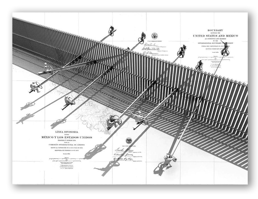
A decade ago two San Francisco Bay Area architects Ronald Rael and Virginia San Fratello reflected on the trade and labor imbalances between the U.S. and Mexico and imagined an art installation that would serve as a thought-provoking metaphor for how actions on one side of the border had direct consequences on the other.  The discussion led them to create architectural drawings and models for a “Teeter-Totter Wall” interactive display.  The work drew the praise from both the Museum of Modern Art in New York and the San Francisco Museum of Modern Art, but the actual installation remained just a concept until this week.

Read More »
Humor

Would You Vote for This Typeface?

Trump_Comic2
A few days ago Meta Design/Font Shop founder Erik Spiekermann expressed his displeasure in a tweet: “Cannot stand that Trump uses my #FFMeta @ FontShop: (only in the background, but still) he only deserves Arial.”
That led Roger Black to tweet: “Trump does not deserve Arial.” Others chimed in that wingdings and dingbats were more appropriate for The Donald. From the incensed outcry of type lovers, one would think that Spiekermann had been violated or defamed by Trump. Type-loving tweeters had very specific views on what kind of personality deserved to use a humanistic sans-serif font that conveyed a calm, reasonable presence, and it wasn’t the bombastic candidate. For the sake of truth-in-typography, we suggest a more suitable option for Trump – Comic Sans.
Trump_Comic