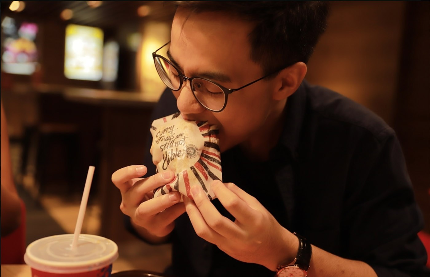
Some of us remember the time when our Japanese grandmothers would give us bite-size pieces of hard candy that we could pop in our mouths wrappers and all. The translucent “tissue” would easily dissolve because it was made out of rice paper. Back then, it was a delightful novelty, but now it may be a solution for the mountains of packaging waste produced by fast-food chains. In Hong Kong, KFC is offering chicken sandwiches wrapped in edible rice paper and printed with edible ink. It makes sense. It cuts down on litter. It’s a tidy way to eat fried chicken without dropping greasy crumbs all over. And it is still “finger lickin’ good.”
Designed by Ogilvy & Mather Group Hong Kong, the edible wrapper was created to pair with KFC’s bunless Double Down sandwich, which features two pieces of fried chicken in place of bread. If you eat every last bite, you are responsibly contributing to the Zero Waste Movement.
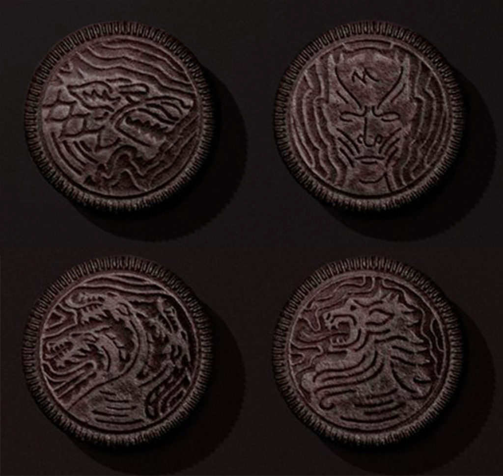
From upper left to lower right: House of Stark, the Night King, House of Targaryen, and House of Lannister
For the two or three people in the modern world who don’t know, Sunday April 14thmarks the start of the eighth and final season of “Game of Thrones” on HBO TV. Based on the adaptation of “A Song of Ice and Fire” book by George R.R. Martin, “Game of Thrones” is a medieval fantasy epic that chronicles the violent dynastic struggles of noble families vying for the Iron throne in the Seven Kingdoms of Westeros. The HBO series, created by David Benioff and D.B. Weiss, is predicted to attract more than one billion viewers worldwide in its final season.
For the two or three people in the modern world who don’t know, Sunday April 14thmarks the start of the eighth and final season of “Game of Thrones” on HBO TV. Based on the adaptation of “A Song of Ice and Fire” book by George R.R. Martin, “Game of Thrones” is a medieval fantasy epic that chronicles the violent dynastic struggles of noble families vying for the Iron throne in the Seven Kingdoms of Westeros. The HBO series, created by David Benioff and D.B. Weiss, is predicted to attract more than one billion viewers worldwide in its final season.
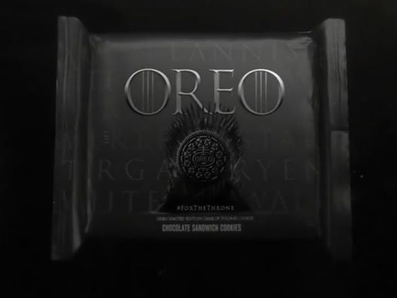
Season eight provided the perfect opportunity for Oreo to issue special edition cookies that would appeal to “Game of Thrones” fanatics. Instead of showing its brand as a friendly chocolatey snack, Oreo emphasized the stark black-and-white appearance of its cookies and stamped them with the crests of the fictional warring families. The packaging, too, showed the sinister-looking iron throne. Oreo and HBO took this brand pairing a step further by teaming with Elastic Creative to substitute the show’s title sequence with a cookie-built version made entirely out of 2,750 Oreos. The brand campaign is so imaginative that the limited edition offering is selling out as fans join in the fun of munching on “Game of Thrones”-themed snacks.
Zombis, made in Iceland by Kjöris, is a soft ice cream product sold in single-serving-size packets, but what makes Zombis extra special is the story built into the packaging. Designed by Reykjavik-based Brandenburg, the packaging for Zombis Freezer Pops features 24 zombi personalities, each with its own name and “death-ography.” Inside each zombi is a colorful, squishy “brain” that tastes exactly like strawberry, raspberry or pistachio-flavored ice cream. Buyers are instructed to snip off the top of the zombi’s head and suck out the brain. Eating ice cream has never been so ghoulish and fun. Read More »
Designed by Futura, a Mexican branding agency in Monterrey, the packaging for Mezcal Buen Suceso looks like a joyful shower of multi-colored confetti. A premium artisanal form of tequila, made from the heart of agave plants. Mezcal Buen Suceso is handcrafted in the Oaxacan village of San Juan del Rio. The vibrant hues of Oaxacan houses inspired the bright colors of Buen Suceso packaging. Rather than print the pattern on the exterior face of the mezcal bottle, Futura called out the pure crystalline quality of the drink by displaying the colorful geometric shapes through the clear liquid and transparent glass. The festive pattern is also presented on the inner lining of Buen Suceso boxes, company stationery, promotional materials, and a rain of tiny confetti dots on Buen Suceso’s website. Read More »
It might be considered tacky to give a bar of soap as a gift, but not if it is beautifully wrapped.
Established in New York more than 30 years ago, Michel Design Works found its niche merchandising tasteful gift products in lovely garden-themed designs and packaging. Scented bar and bubble bath soaps, body lotions, paper napkins, coasters and placemats, kitchen towels and potholders, and the like are delightfully decorated with antique botanical prints. In the case of the soap, the wrapping paper makes the product look like a luxury item, but is inexpensively priced to give as an appropriate hostess thank-you or as a shower party favor. The packaging for the soap even features the Michel Design Works’ elephant logo as a hot-wax seal. What makes this soap “gift-worthy” is not the actual bar of soap (however good it is); it’s the packaging. The packaging defines the brand.