Graphic Symbols of Valentine’s Day
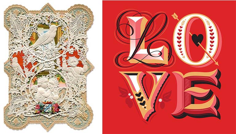
Love is in the air, and no one is more enthralled with Valentine’s Day than florists, chocolatiers, and greeting card vendors. Consider these Valentine’s Day statistics for the U.S. alone: 110 million roses are sold February 14, 58 billion pounds of chocolates, and 145 million Valentine’s Day cards. Named for St. Valentine who died on February 14 after being tortured and beheaded by a Roman Emperor, Valentine’s Day, in the romantic sense that as we think of it today, did not catch on until the Victorian era and owes much of its popular success to rapid advances in printing, paper and mass production technologies. Over the ages, Valentine’s Day evolved its own romantic ideographs – the color red, stylized heart shape, Cupid shooting arrows dipped in desire and erotic love, birds chirping to attract a mate, and typographic flourishes bursting with rapture. The Victorian card, on the left, is overlaid with a delicate doily that reveals embossed, die-cut printed images on the paper beneath. The contemporary card, on the right, designed by lettering artist Jessica Hische, expresses the exuberant complexity of love by the way the letterforms are drawn.

Happy Valentine’s Day.

Film

The Many Sad Fates of Mr. Toledano

MrToledano
MrToledano2
How do you design a film poster that suggests how humans come to inhabit a different body over time? This is the subject of a new documentary called “The Many Sad Fates of Mr. Toledano,” which premieres at the Tribeca Film Festival this week. The film was produced by filmmaker Joshua Seftel who has produced and directed several award-winning documentaries for television, radio and theater release. “The Many Sad Fates of Mr. Toledano” is about famed photographer Phillip Toledano’s effort to envision the ways his life would change over the next 40 years. The project is a continuation of an exploration of aging that Toledano presented in a photo journal on his father’s final years. Called “Days With My Father,” the journal visually tried to reconcile the active, handsome man his father once was with the decrepit old man plagued by severe memory loss. In this film Toledano “fast-forwarded” himself through theatrical makeup to picture how he would be at various stages of his life.

The discussion of an appropriate poster design for “The Many Sad Fates of Mr.Toledano” began between Seftel and Kit Hinrichs while they were on a long flight to Saudi Arabia. When Kit returned to the States, he developed several poster options, three of which are shown here. The top one was the final choice. The one at bottom left simply shows Toledano’s face. At bottom right, the collage of rectangular pieces shows abrupt facial changes, whereas the top image, with the thinly sliced horizontal strips, seem to vibrate Toledano’s facial features, suggesting a gradual, constant change.
Read More »

Advertising

Aurora Matchmaking with Wine

Aurora_1

Aurora Vinicola, the biggest winemaking cooperative in Brazil, took a direct approach to recommending wine pairings in these print advertisements created by the agency Dez Comunicação in Porto Alegre, Brazil. Photographer Pedro Minanez and illustrator Miagui Imagevertising did some “photoshop” collaboration to suggest that when poultry, fish and beef are served with the right wine, the occasion becomes even more delightfully festive.
Read More »

Technology

How Much Space Do We Really Need?

Transformation_Office

A team at the Harvard Innovation Lab undertook a project to reveal how desktops have evolved since the first personal computer appeared 35 years ago. Photographed by dougthomsen.tv and engineered by anton georgiev, the video version below shows how office necessities (e.g., Rolodex, reference books, hand-held calculators) have gone from the actual to the virtual, from physical objects to digital apps. The video, as seen on Designboom.com, is a fascinating look at how technology has transformed office tasks. It also suggests that offices of the future should be redesigned accordingly. Corporations once filled vast high rises with thousands of employees, hundreds of file cabinets and office equipment, and rows of clerical help to handle all kinds of paperwork. Today “offices” are essentially portable. Workers don’t have to be tethered to their desks. They can stuff their laptop and mobile phone in their backpacks and set up shop anywhere. So, what is the purpose of gathering employees into a single workspace? What kind of furniture and equipment will make workers more productive and more collaborative? With so many documents stored in the clouds instead of in metal file cabinets, can the physical office layout be sized to take up less square footage? It’s time to occupy no more space than we really need.

For the original, click to the producers, Bestreviews.com.

Read More »

Photography

Brazilian Ad Man Turns Photo Portraitist

One of the most inventive and experimental minds in the arts, Vik Muniz has made portraits out of sugar, dirt, dust and chocolate sauce, and now he has made portraits out of photos. Based in Brooklyn, Muniz started out in advertising in his native Brazil, redesigning billboards for greater readability. After picking up his first advertising award at a black-tie gala, Muniz attempted to break up a fight between two gala attendees, and was accidentally shot in the leg by one of the brawlers. The shooter paid Muniz not to press charges and that gave Muniz enough money to move to New York where he took an interest in sculpture and photography. Muniz, who says he has an interest in making pictures that “reveal their process and material structure,” made this series of portraits out of old photographs and then photographed the portraits.

Read More »