Coronavirus on Earth Day

Giving Thanks on Earth Day

Poster Designed by Craig Frazier

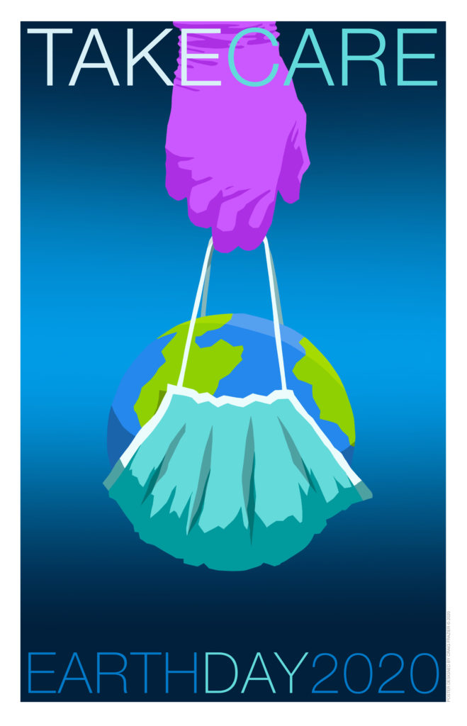
April 22nd marks the 50th anniversary of Earth Day, which most years focuses on how mankind is endangering the environment and the creatures that inhabit the earth.  This year illustrator Craig Frazier created a poignant reminder that humans are also an interconnected part of this ecosystem. With the coronavirus pandemic threatening our very existence, it behooves us to remember that we are all part of one earth.  Explaining how he arrived at this year’s Earth Day theme, Craig said, “At this time, we need to take care of those who are taking care of us all over the world.  I designed this poster to honor the health care workers who are doing the heavy lifting.”   Indeed. 

Posters

Poster Show Promotes Tolerance

For centuries, wall posters have been a favorite means to publicize events, products, causes, political movements and the like. It is a sad commentary on the 21st century that we need to use this public vehicle to draw attention to an idea as basic as Tolerance. Unfortunately, we do.

“Tolerance” is the name and theme of a traveling poster show that is now circling the globe. Organized by Bosnian-born and now New York-based, Mirko Ilic, the Tolerance Traveling Poster Show features the contributions of renowned designers including Milton Glaser (USA), Chaz Maviyana-Davies (Zimbabwe), Yuko Shimizu (Japan), Manuel Estrada (Spain), Tarek Atrissi (Lebanon), Jianping Ha (China), and some two dozen others.

To keep the exhibition accessible to a broad audience, the posters are shown in public plazas, shopping malls, parks, and other open venues instead of in art galleries and art museums. Conceived to be electronically produced and hung anywhere in the world within a week, the Tolerance posters show is expected to run for two years. To date, it has been shown on nearly every continent, with illustrators and designers from exhibiting countries contributing their own Tolerance poster to the show.

Read More »

Public Service

Don’t Walk. Dance.

In every big city, more pedestrians run red lights than motorists. Impatient and confident that no driver would purposely run them over, they dart across the red lights or inch off the curb and into the intersection to get a head start when the light turns green. This doesn’t happen much in Los Angeles where automobiles are “king,” and pedestrians know that they have few rights.Cars speed down city streets, daring a walker to step into their path. On the other hand, San Francisco has always been more pedestrian lenient. Motorists get annoyed with “red light jumpers” and jaywalkers, but perhaps are more forgiving because they know how steep the hills are and recognize that trudging across a hill is an ordeal for the elderly, disabled, and anyone carrying a heavy bag.

In Lisbon, Portugal, the company behind the Smart car successfully tested a novel deterrence, and it didn’t do it by stationing traffic cops at every crosswalk, handing out fines, or constructing barricades. It used entertainment. Smart Company installed “dancing traffic lights” that projected moving pictographs of passersby dancing in real time in a specially designed booth. The dancing signal was so engaging that red-light jumping was reduced by 81%. Now the question is how to get pedestrians to move along and cross the street.

Does Ugly Packaging Turn Off Consumers?

Left to right: Transitional packaging, 2012; current packaging

We all know that beautiful packaging helps sell products, but what is the effect of a package purposely designed to be ugly — not just ugly, but gross and icky?

In December 2012, Australia took an unusual approach to curb smoking. It didn’t ban cigarettes outright, but it did ban all design branding devices on cigarette packs. It outlawed any evidence of brand distinction and personality. Gone are iconic images of rugged, independent men on horseback and slim, stylish women who look like they know how to have fun. Instead Australia imposed what it described as standardized, or plain, packaging on tobacco products. Based on the premise that great design is persuasive and sells products, Australia used reverse psychology to change attitudes. It outlawed brand design elements including bright colors, logotypes, slogans, and taglines. It ruled that packs can only use Pantone 448c opaque couche, which market researchers deemed the world’s ugliest color, and the brand name now has to be shown in a specified generic font, size and location. Health warnings have to cover 60 percent of the pack’s surface, with photographs of diseases brought on by smoking. Instead of glamorizing the “coolness” of smoking, the plain packaging aims to get people to think twice about how smoking affects their health, and discourage youth from taking up the habit at all. In the first 36 months of Australia’s program, it is estimated that there are about 118,000 fewer Australians smoking as a direct result of standardized packaging.
Read More »

Public Service Campaign

Motorola: It Only Takes One Letter

motorola_text_1
Consider this: One out of every four car accidents in the U.S. is caused by texting when driving. Texting while driving is now the leading cause of teen deaths. The problem is prevalent anywhere on the planet that has cell phones and distracted drivers, as is evident by this print ad created by F.Biz in Sao Paulo, Brazil. This skid marks public service message wasn’t done by a car manufacturer or the highway patrol; it was sponsored by mobile-phone maker, Motorola.
Read More »