Public Service Campaign

From the Ears of Autistic People

How do you describe in words what autism feels like from the perspective of the person afflicted with the disorder? Sometimes verbal explanations seem inadequate, incomplete, superficial. It’s better to show it and hear it from their eyes and ears. Rattling Stick Production Company made this public service video for the National Autism Society in the UK to help viewers feel the sensory way that some autistic people experience the world. Sounds that most people don’t even notice affect them with the jarring impact of a pile driver. The video was directed by Steve Cope, with creative direction by Kit Darayam. Turn up your sound to get the full effect.

Poster

Kaiser Wants You To See The Light

7 Daily Moves

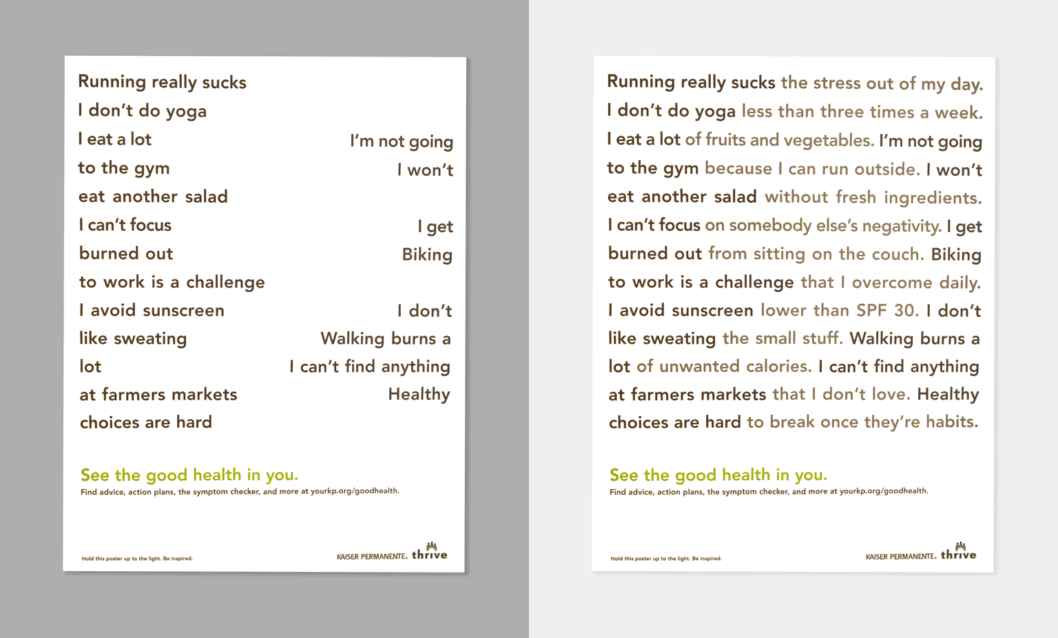
This is a 17”x 23” handout from Kaiser Permanente Healthcare. We couldn’t learn who created it, but find it effective in its simplicity. A low-budget production piece on uncoated stock, the Kaiser poster is printed on one side with a list of lame excuses for not exercising or eating right, but hold the sheet up to the light and the type set in reverse on the back side fills in the empty spaces and presents a totally opposite and much healthier point-of-view. It’s a no-frills piece that is cleverly written and designed. Bravo whoever you are. Well done.

Public Service Advertising

Cheeky Ads Raise Cancer Awareness

ColonCancerAwareness

How do you publicize something that is widely considered socially rude to talk about? It’s okay to urge people to get regular dental exams, annual mammograms, eye tests, and melanoma check-ups, but suggesting the need for a rectal exam is usually not well received (and often not meant in the kindest way). Yet colon/rectal cancer is the second most deadly cancer in America. Ironically, it is also one of the most treatable types of cancer if detected early through regular rectal exams. Meredith’s Miracles Colon Cancer Foundation wanted to bring these facts into the public discussion and asked the ad agency, FCB Chicago, to raise awareness through a public service ad campaign. FCB delivered the warning to Chicago commuters by selectively posting ads on the back side of bus seats. In this case, the placement of the ad is the butt of the joke.

Typography

Typography by the Homeless

Sadly, the sight of a homeless person holding a hand-scrawled sign asking for spare change has become all too familiar in cities around the world. Barcelona-based Arrels Foundation and The Cyranos McCann ad agency found a novel way to respond to such handwritten appeals. They created Homelessfonts.org to market typefaces drawn by the homeless in Barcelona to businesses for use in advertising and packaging. In different workshops, volunteer design professionals led homeless participants through various typographic exercises, which were then scanned and converted into usable fonts. The fonts are being sold on the Homelessfonts.org website, and collected funds are being used by Arrels to offer shelter, food, and social and health care services to the indigent in Barcelona. Arrels reports that about 3,000 homeless are currently in Barcelona, 900 of whom actually live in the street. Type design is an unusual charitable fund-raising initiative, to say the least, but it has given Arrels the resources to care for nearly half of the homeless in Barcelona.

Posters

AIGA Get Out the Vote Posters

Get_Out_the_Vote_1
The first Tuesday in November is election day in America, and tomorrow citizens are supposed to go to the polls to exercise their Constitutional right to vote. If turnout in past midterm elections is a guide, less than 40% of the voting age population will claim that privilege. Shame!

For the past few Presidential elections, the AIGA has hosted a Get Out The Vote poster campaign as a public call to action. Since the AIGA doesn’t create posters for midterm elections, we thought we’d revive some posters designed for the 2012 election. (The one above was done by Kit.)

Claim your future, vote.

Get_Out_the_Vote_2