Typography

2015 Typography Calendar
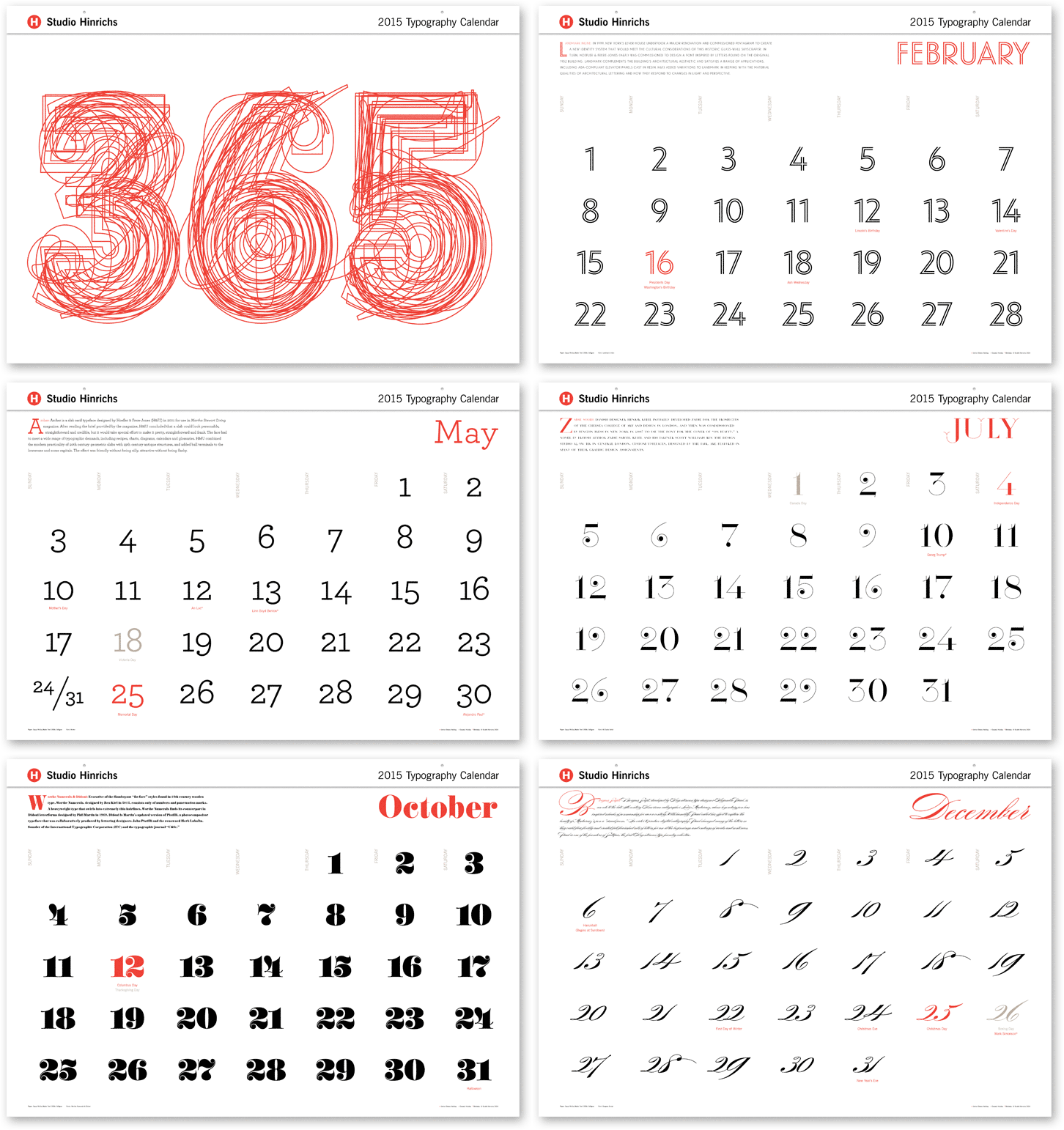
2015_Type_Cal

For the past 13 years, Kit Hinrichs has been indulging his fascination with typography by creating the “365” calendar, featuring 12 different typefaces, one for each month of the year. What makes him happy (in my opinion) is viewing each letterform as its own little sculpture — whereas combining characters into words and sentences distract from seeing typography as its own art form. For the 2015 calendar, Kit asked his design staff to nominate fonts that intrigue them and assembled a mix of traditional, avant garde, serif, sans serif, display, and script faces. Then for the 13th straight year, he cajoled me into writing the text. The 365 Typography Calendar for 2015 is now available for sale via Amazon, major U.S. art museums, and from Studio Hinrichs. The calendar comes in two sizes: 23” x 33” (58.5cmx84cm) for $44 retail and 12”x18” (30.5cm x 45.75cm) for $26 retail. Design professionals, particularly, love this calendar and display it prominently to prove their “street creds.” Order now.

Advertising

Lurpak: A Kitchen Space Odyssey

Created by Wieden & Kennedy London and directed by Dougal Wilson at Blink, “Lurpak Cook’s Range: Adventure Awaits” is the latest episode in a series of commercials that expose home cooks to the exhilarating universe that they have been yearning to explore. This 60-second epic journey opens to the majestic strains of the soundtrack from Stanley Kubrick’s “2001: A Space Odyssey” and closes in tightly on a mysterious landscape of bumpy cauliflowers, gnarled ginger outcroppings, an artery of pomegranate kernels, and membranes of flaky bread.

It’s bold. Challenging. Heroic. It’s all about butter and cooking oil! This ad for Lurpak, maker of premium Danish butter and cooking oils, is intended to inspire and encourage intrepid cooks to venture forth and discover new culinary frontiers, secure in the knowledge that Lurpak butter won’t let them down.

Viral Marketing

Moon Over Corona Beer

Winner of a 2014 Cannes Outdoor Advertising Award, this Corona Extra billboard campaign feels like a high school science project on steroids – e.g., drop a raw egg from 30 feet without breaking it, make a rocket that can shoot across a football field, build your own fog tornado. In this case, Corona and its ad agency Cramer-Krasselt in Chicago came up with a way to put a real crescent moon on top of a Corona bottle billboard.

It was all very clever and fun in a geeky way. The idea involved showing an open bottle of Corona Extra surrounded by the moon in its different phases. The beer bottle itself butted up to the top edge of the billboard. By calculating the angle of the moon at a specific geographic location, the time that it would be in its crescent phase, and other measurements, the creative team could precisely predict when the moon would rest on the bottle top like a wedge of lime. Such calculations, however, are typically beyond the ken of “right brain” advertising people, so they turned to experts at top universities and planetariums for help. The consensus was that on June 14 and June 15, 2013, the crescent moon would be positioned over the bottle top shown on the billboard at 15th Street and 9th Avenue in Manhattan. The historic lunar lime event was publicized online and via social media and created such a buzz that spectators came out specifically to witness the moon hovering over the Corona bottle. Such an occurrence is even rarer than a lunar eclipse.

Advertising

Aurora Matchmaking with Wine

Aurora_1

Aurora Vinicola, the biggest winemaking cooperative in Brazil, took a direct approach to recommending wine pairings in these print advertisements created by the agency Dez Comunicação in Porto Alegre, Brazil. Photographer Pedro Minanez and illustrator Miagui Imagevertising did some “photoshop” collaboration to suggest that when poultry, fish and beef are served with the right wine, the occasion becomes even more delightfully festive.
Read More »

Viral Marketing

Joe Boxer’s “Jiggle Bells, Jiggle Bells”

Fresh on the heels of last year’s titillating Kmart Joe Boxer pelvic jingle choir comes this holiday’s belly-beat encore. Avoiding some of the flack they took for featuring handsome young men who looked like they were hired from the Chippendale chorus line, this year ad agency FCB/Chicago chose a not-so-buff, beer-belly cast dressed in Joe Boxer pajama bottoms. Instead of naming the spot “Show Your Joe” like last year, the sequel is called “Jingo Bellies.” Either way, the commercials are funny, and a refreshing change from the usual cloyingly wholesome holiday ads showing loving couples in ski sweaters drinking hot chocolate by a roaring fireplace.

Read More »