Typography

2015 Typography Calendar

2015_Type_Cal

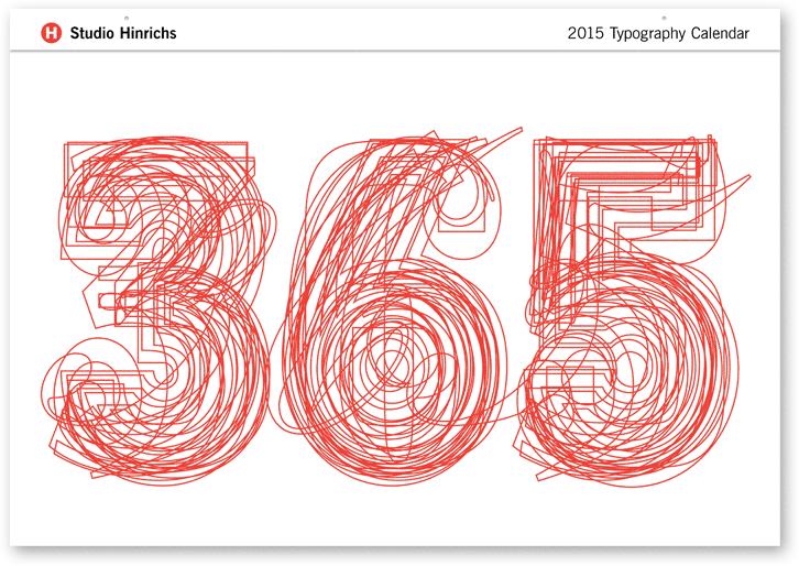
For the past 13 years, Kit Hinrichs has been indulging his fascination with typography by creating the “365” calendar, featuring 12 different typefaces, one for each month of the year. What makes him happy (in my opinion) is viewing each letterform as its own little sculpture — whereas combining characters into words and sentences distract from seeing typography as its own art form. For the 2015 calendar, Kit asked his design staff to nominate fonts that intrigue them and assembled a mix of traditional, avant garde, serif, sans serif, display, and script faces. Then for the 13th straight year, he cajoled me into writing the text. The 365 Typography Calendar for 2015 is now available for sale via Amazon, major U.S. art museums, and from Studio Hinrichs. The calendar comes in two sizes: 23” x 33” (58.5cmx84cm) for $44 retail and 12”x18” (30.5cm x 45.75cm) for $26 retail. Design professionals, particularly, love this calendar and display it prominently to prove their “street creds.” Order now.

Design Quizzes

Quiz: Abandoned Logos

There are many reasons why corporations update, revise or simply abandon their logos. The old mark may feature antiquated technology or not be politically correct by today’s standards. It may no longer reflect who they are, the size of their current business or what they sell. Or it may have been drawn by the founder or a promising art student when the firm was a cash-poor startup. Whatever. The result was a logo that looked amateurish and generic. This is a tough quiz, made harder because we had to remove the brand names on some logos so they didn’t give away the answer. When you pair the logo with the brand however, you’re likely to be surprised. Good luck!


Read More »

Publishing

A Bibliophile’s Addiction by Kit Hinrichs

Editor’s note: Anybody who has been around Kit Hinrichs for long knows that he can’t resist beautifully designed books, especially if they are on design and typography. So, we asked him to tell us his favorite books from 2010 and why he liked them. We made him cull his favorites down to 9. Here’s what he had to say.

Kit's Books

Here are my favorites. 1. George Lois, The Esquire Covers @MoMa. A look at some of the best magazine covers… EVER! 2. Mapping America: Exploring the Continent. A magical look at cartography from Lewis & Clark to the typographic textures of Paula Scher. 3. Alphabets: A Miscellany of Letters. An historical look at curious typographic forms from the origin of alphabets to x-rated typefaces.
Read More »

Environmental Graphics

The New Library

Over the past couple of weeks two separate stories appeared in the news. One was a report by Amazon that for the first time its e-books outsold its hardcover titles. For the quarter, Amazon says it sold 143 e-titles for every 100 hardcover books.

The other story, which appeared in San Francisco Bay Area newspapers, was about the town of Walnut Creek’s new library, which incorporated 17 original works of art at a cost of $300,000. The neighboring town of Lafayette (population 25,000) spent roughly $400,000 on paintings, photographs, sculptures and prints when it rebuilt its library last year. The local paper described this new crop of libraries with conference rooms, fireplaces, computers and cafes as “community living rooms.” Libraries are not just repositories for books anymore. Some public libraries are redefining their role by positioning themselves as knowledge centers free and open to the entire community – not a museum, not a school, not a social club, but a place that bridges the digital divide and draws together those who share a love of art and learning.

Read More »