Typography, Information Graphics

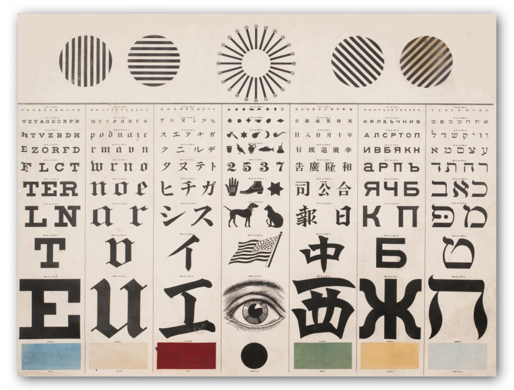
International Eye Charts: The Better to See You

George Mayerle’s Eye Chart in Roman, Hebrew and Chinese

Designers are a trend-conscious lot when it comes to typography.  They like to keep up with the latest edgy typefaces, and will opine endlessly over the historical contributions of Baskerville and Caslon, discuss the attitude evoked by various faces, and when too much kerning or letter spacing makes words illegible… yada, yada, yada, yawn.

Forget all that. Your design-centric pontificating doesn’t matter when it comes to the best typeface for eye exam charts.

English Eye Chart, Left and Greek Eye Chart, Right

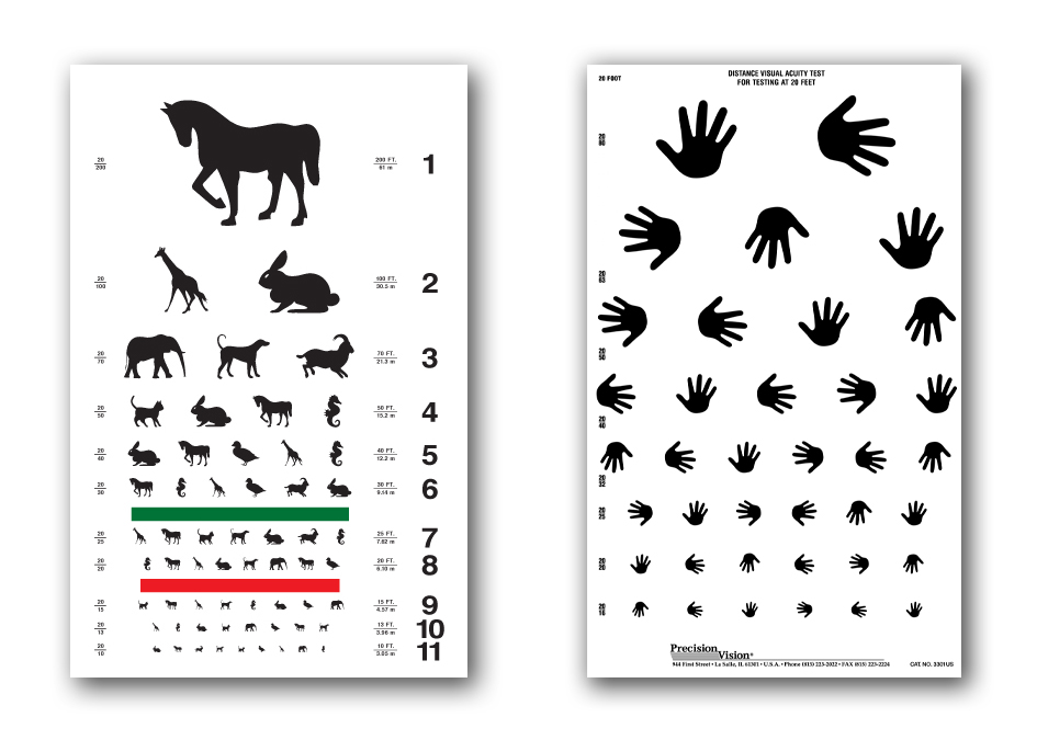
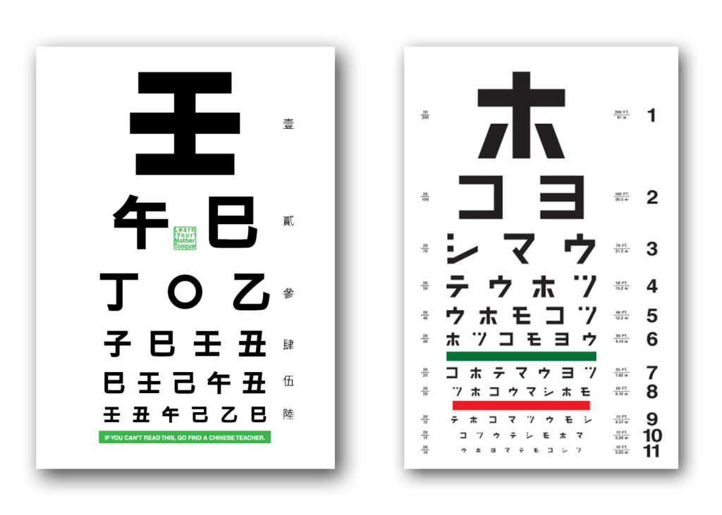
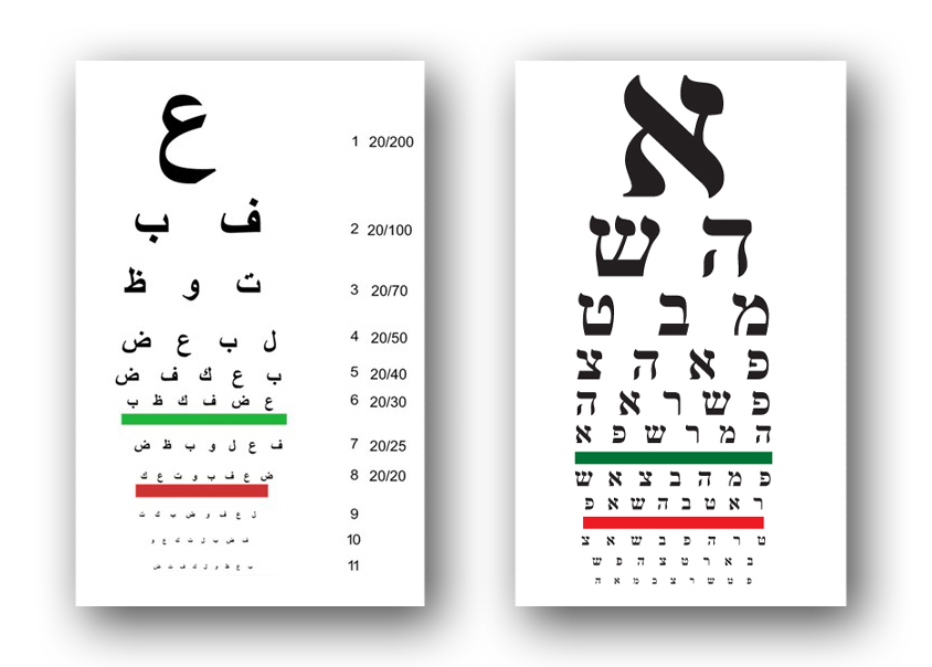
Eye exam charts are not designed to be elegant or trendy.  They are based on medical science and geometric measurements. We can’t speak for how “optotype” is rendered in Chinese or Hebrew, but the letters on the English charts are all caps with no thicks or thins in the letterforms.  The same principles undoubtedly apply in other language eye charts as well.  In the case of children and people who can’t read, eye charts test the ability to recognize familiar animals and the direction a hand is pointing. 

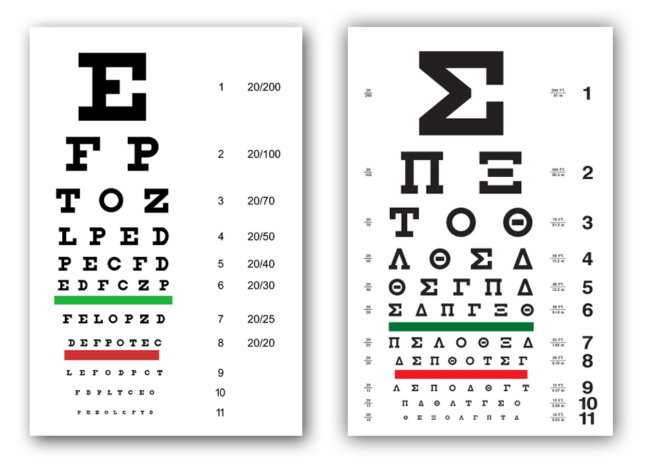
Dutch eye doctor Hermann Snellen developed the now famous Snellen eye chart in 1862 by asking patients to cover one eye and read letterforms on a 5×5 grid, while standing 20 feet (or 6 meters away).   The optotype is based on simple geometry in which the thickness of the lines equals the thickness of the white spaces between lines and the thickness of the gap in the letter “C”.  The height and width of the type must be five times the thickness of the line. 

Animal and Hand Direction Eye Charts for Children
Chinese Eye Chart, Left and Japanese Eye Chart, Right
Arabic Eye Chart, Left and Hebrew Eye Chart, Right

The common Snellen chart uses only ten letters C, D, E, F, L, N, O, P, T, Z.  The British Standards Institution specifies twelve letters — C, D, E, F, H, K, N, P, R, U, V, Z — based on the equal legibility of the letters.  It also requires uniform luminance.  Visual acuity tests in doctor’s offices use the same eye charts, but exams for a motor vehicle license randomize letters so vision impaired motorists can’t cheat by memorizing the sequence of letters on the chart. 

Humor

Would You Vote for This Typeface?

Trump_Comic2
A few days ago Meta Design/Font Shop founder Erik Spiekermann expressed his displeasure in a tweet: “Cannot stand that Trump uses my #FFMeta @ FontShop: (only in the background, but still) he only deserves Arial.”
That led Roger Black to tweet: “Trump does not deserve Arial.” Others chimed in that wingdings and dingbats were more appropriate for The Donald. From the incensed outcry of type lovers, one would think that Spiekermann had been violated or defamed by Trump. Type-loving tweeters had very specific views on what kind of personality deserved to use a humanistic sans-serif font that conveyed a calm, reasonable presence, and it wasn’t the bombastic candidate. For the sake of truth-in-typography, we suggest a more suitable option for Trump – Comic Sans.
Trump_Comic

Typography

Target Food for Thought

Target_FoodforThought1
Columbus, Ohio-based Danielle Evans, who goes by the firm name Marmalade Bleue, pursues a quirky design genre – food typography. She uses food ingredients to create very ephemeral letterforms, such as in a “Food for Thought” video for Target stores.

On her Marmalade Bleue blog, Evans explains how her approach differs from others who have used food ingredients as a writing medium. “Food type had been used sparingly as one-offs in the past, all of which utilized the materials incidentally without applying a typographer’s touch,” she says. “The novelty of food as lettering trumped the presentation and legibility of the forms. I chose to apply my background in illustration, sculpting, and painting to create letterforms with dimension, play of light and edges, and happenstance flourishes with personality.”

Describing her methodology, Evans adds, “Rarely do I use typefaces or fonts to influence my work, instead I rely on the materials to dictate the best course. I’ve chosen a symbiotic relationship with my materials, suggesting rather than forcing their direction. Lettering allows for incidental flourishes and ligatures associated with calligraphy, the true nature of my work.” Intriguing and beautiful.
Read More »

Typography

2015 Typography Calendar

2015_Type_Cal

For the past 13 years, Kit Hinrichs has been indulging his fascination with typography by creating the “365” calendar, featuring 12 different typefaces, one for each month of the year. What makes him happy (in my opinion) is viewing each letterform as its own little sculpture — whereas combining characters into words and sentences distract from seeing typography as its own art form. For the 2015 calendar, Kit asked his design staff to nominate fonts that intrigue them and assembled a mix of traditional, avant garde, serif, sans serif, display, and script faces. Then for the 13th straight year, he cajoled me into writing the text. The 365 Typography Calendar for 2015 is now available for sale via Amazon, major U.S. art museums, and from Studio Hinrichs. The calendar comes in two sizes: 23” x 33” (58.5cmx84cm) for $44 retail and 12”x18” (30.5cm x 45.75cm) for $26 retail. Design professionals, particularly, love this calendar and display it prominently to prove their “street creds.” Order now.

Packaging

The Best Type of Wine

Trapl_Wine_1
Like fine wine, beautiful typography adds a touch of elegance wherever it appears. Creative agency Typejockeys in Vienna, let the typography serve as the graphic identity and packaging for Trapl, an award-winning wine made in Stixneusiedl, Austria, by vintner Johannes Trapl. Each of the seven varieties in the Trapl line has a uniquely designed label featuring Typejockeys’s hand-drawn letters, frames and ornaments. All the legal information is integrated into the wraparound typographic label, so there is no “back side.” Copper-colored foil stamping and blind embossing make for a sophisticated design that is consistently carried through even on the packing boxes.
Read More »