After El Paso and Dayton

Words When Pictures Fail

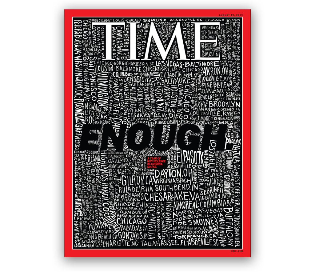
Cover Art via time.com

A constant struggle for editorial artists is the search for a way to capture the essence of a story in a single powerful image.  Unfortunately, picturing a semiautomatic assault weapon, as sinister as it looks, no longer shocks readers.  In fact, guns and even images of crying survivors of mass killings feel cynically banal.  That’s why this week’s Time Magazine cover stopped us in our tracks. San Francisco Bay Area artist John Mavroudis simply hand-lettered the 253 locations of mass shootings in America so far this year and added the word “ENOUGH.”  The crude lettering is crammed onto the page with city names shown vertically, sideways and at a slant in large letters and small, filling every nook and cranny. Mavroudis calls his drawing “a frightening portrait of a country drowning in gun violence.”  Indeed, the effect is chilling and memorable and gives perspective to our epidemic of domestic terrorism. 

Design Classic

Band-Aid®: How a Brand Became a Generic

Band-Aid2
People have forgotten – or hadn’t considered it in the first place – that Band-Aid® is a trademarked brand registered by pharmaceutical and medical device giant Johnson & Johnson (J&J). For most of us, Band-Aid generically describes any kind of adhesive bandage with a gauze pad in the center. The term has even become part of our colloquial language –e.g., who hasn’t called a temporary fix a “band-aid solution.” Actually, Band-Aid was invented in 1920 by Earle Dickson for his wife, Josephine, who was a bit accident-prone around the house. Dickson, a New Jersey cotton buyer for J&J, noted that his wife often used tape to hold cotton balls over her nicks and burns, but the tape usually fell off as soon as she returned to her task. Dickson devised an easier method; he placed squares of surgical gauze at intervals on a strip of tape and used a length of crinoline to keep the tape from sticking to itself so it could be stored rolled up. All Josephine had to do was unroll the tape, cut off as much as she needed and dress her own wound. Dickson mentioned his little invention to colleagues at J&J and his boss thought it was so ingenious that Dickson’s idea was put into production. At first, Band-Aid Adhesive Bandages had to be made by hand and were an awkward 2 ½ inches wide by 18 inches long. In 1924, J@J moved Band-Aid into mass machine production and resized the product to ¾ inch wide and 3 inches long, with a thin red thread to pull off the paper wrapper. Targeted to young families, J&J promoted Band-Aid by donating the product to Boy Scout troops across the U.S. Sales took off. By World War II, Band-Aids were standard issue in soldiers’ mess kits. Band-Aid products became so ubiquitous, the brand was not only the market leader for this category of adhesive bandages, it became synonymous with all products in this category, much to the chagrin of Band-Aid’s competitors.
Design Education

Founding Fathers Stiff Flag Designer

As we celebrate Independence Day in the U.S., it seems fitting to give credit where credit is due to Francis Hopkinson, who substantial evidence shows designed the first American flag in 1777. Hopkinson, a New Jersey lawyer and signer of the Declaration of Independence, had a natural love of heraldry and art, and dabbled at graphic design (a profession that didn’t exist back then). During the American Revolution, Hopkinson was serving as chairman of the Navy Board’s Middle Department, when it got an urgent request to come up with an official banner of some sort that soldiers could carry into battle. At the time, the rebelling colonies were flying a flag that featured a variation of the British Union Jack in the canton surrounded on three sides with horizontal red and white stripes. (It looked like a knock-off of the British East India Company flag.)

Read More »

Information Graphics

Statehood History Explained with Postal Stamps

This one-of-a-kind flag assemblage, from Kit Hinrichs’ vast Stars & Stripes collection, was designed by the quartermaster of a U.S. military post office during World War II. A closer look reveals that it is not just a flag made out of a bunch of used stamps and cancellation marks; it is clever information graphics. The blue canton is made from dozens of five-cent stamps, and the stars are cut from cancellation marks mailed from the state capital of each of the 48 states that were in the Union in 1943 (see detail after the jump). The unknown artist didn’t stop there. He placed the stars chronologically according to when each state entered the Union. The red stripes are composed of two-cent stamps (yes, they once existed!), and the white stripes are pieced together from envelopes mailed from the states that were part of the Original Thirteen Colonies that declared their independence from Great Britain on July 4th, 1776, and founded a new nation of united states. Something to think about while waiting for the fireworks to start. Happy Fourth of July!

Read More »

Architecture

Iconic Styles of Renowned Architects From A to Z

Argentine architect Andrea Stinga and Colombian graphic designer Federico Gonzalez put together this animated video of globally renowned architects and their most notable work. The minute-and-a-half long video manages to squeeze in a lot of information, including architects and landmarks from around the world. Still, art director Gonzalez apologizes that some legends had to be left out because they only needed one architect per letter of the alphabet. Stinga is a principal in Ombu Architecture, based in Barcelona, Spain. The music soundtrack is “The Butterfly” by Eugene C. Rose and George Ruble.