Logo Quiz

Earth Day 2019

Have you done something nice for your planet today?   It’s Earth Day.

Since the first Earth Day was celebrated in 1970, many positive environmental protection victories have occurred.  We have phased out cancer-causing asbestos, took the lead out of gasoline, banned toxic DDT and PCBs, cleaned up waterways enough so that rivers don’t spontaneously burst into flames, made progress plugging the ozone hole, saved the bald eagle and the black-footed ferret from extinction, instituted measures to design “green” buildings, among other positive achievements.  

Despite these noteworthy improvements, the earth is not in the clear.  Human use of fossil fuels have largely caused carbon dioxide levels to rise by 46 percent in the last century.  Higher atmospheric temperatures are causing the polar ice cap to melt and sea levels to rise. The earth’s glaciers are losing up to 390 billion tons of ice and snow a year.  Nearly 100 billion plastic bags are used in America every year. The world’s scientists say that there is a 99.9999% chance that humans are the cause of climate change. 

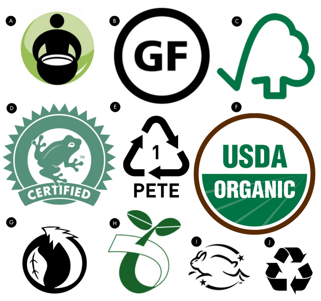
Many industry watchdog agencies are taking action and certifying products and companies that follow responsible environmental practices, acknowledged their efforts by giving them the right to display “seal of approval” labels on their products. Today there are literally hundreds of green product certification labels in the U.S. alone. This little quiz challenges your knowledge of a few of them.
Read More »

Fine Art

And You Thought That Paper Was Just for Printing!

Even standing up close, Beijing-artist Li Hongbo’s sculpture of Michelangelo’s David looks like it is made out of marble or porcelain, but when it is gently pulled up, the bust stretches out beyond recognition, and when released, springs back to its original shape like a Slinky toy. The raw material that Li Hongbo uses for his sculptures is paper, thousands and thousands of sheets of paper. His average classical busts require gluing more than 5,000 sheets of paper together in a honeycomb pattern, using pressure to hold the sheets together. From there, he saws, cuts and shapes the huge block of glued paper to arrive at a rough sculpted form. Li Hongbo then shaves in the finer details and uses sandpaper to smooth the surface.

Read More »

Packaging

Eco-Friendly Paperboy Challenges Wine Traditions

Wine packaging is steeped in tradition and sometimes unfounded biases, and connoisseurs are quick to form opinions about the quality of wine inside by the bottle’s shape, color and design. The cork versus screw cap debate, for instance, has been going on for well over a decade. So, it will be interesting to note the wine-drinking market’s response to Paperboy, packaged in a bottle made entirely from compressed recycled paper. UK packaging producer GreenBottle teamed with California wine producer Truett-Hurst to unveil the world’s first paper wine bottle. It is being sold in Safeway supermarkets on the West Coast now, with plans to offer it across the U.S. soon. London/NY-based agency Stranger & Stranger designed the Paperboy label graphics, which were printed with natural inks.

GreenBottle reports that the paper bottle, with a liquid-tight insulated plastic bladder inside, has a carbon footprint that is one third of an equivalent glass bottle. The bottle is feather-light, weighing about an ounce when empty, thus reducing shipping, handling and energy consumption costs. Despite its lightweight, Paperboy bottles are said to be rigid and strong, and ice bucket safe for three hours. Sounds good. Now let’s see if wine snobs can get past the fact that they’re drinking a brand sold in a paper bottle.

Read More »

Packaging

Branding of Dripp Coffee

The visual identity system for Southern California-based Dripp Coffee Shop is intriguing for what is fixed and what is flexible. Designed by Turner Duckworth San Francisco and London, the Dripp branding system centers around a hand-drawn script logotype which angles upward. The rest of the visual content is structured within a grid of color blocks with minimal flat-graphic images. The flourished style of the letters sets the logo apart from the rest of the visual content and, by contrast, draws attention to itself. The silhouetted objects themselves can be changed to suit the product, season or event, as long as they retain the stylized look and simplified color palette of the brand – as shown in the set of posters below created by Turner Duckworth. This graphic system also accommodates changing needs and uses, including this sleeveless hot paper cup design by Istanbul-based designer Salih Kucukaga.


Read More »

Motion Graphics

Jekyll & Hyde: A Moving Story

New technologies go through a number of phases as they progress from “drawing board” idea to prototype to public awareness, assessment of possibilities, learning and experimentation, to practical applications. Augmented reality (AR) seems to be in the late experimentation phase, although some very practical commercial uses are being introduced. Here two Swiss AR experts Martin Kovacovsky and Marius Hugli demonstrate the possibilities of AR by bringing the pages of “The Strange Case of Dr. Jekyll and Mr. Hyde” to life. The images printed on the paper leap into action on the screen when a camera (in the lamp) is focused on a page. Suddenly, traditional print becomes a multimedia vehicle, and the boundaries between analog and digital content all but disappear.