Brand Logos

Chinese Signs of the Times

Chinese_Neon
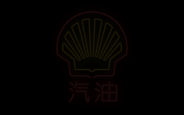
Through the use of neon signs, Mehmet Gözetlik, Istanbul-based art director of Antrepo design agency, demonstrated how 20 of the best-known Western brands might be translated into Chinese.

In an interview with the International Business Times, Gözetlik pointed out that China is now the world’s largest economy and has a current population of 1.35 billion people. Yet, he adds, foreign companies take a literal and phonetic approach to presenting their brand, instead of considering how the logo translates visually and culturally. “Most of today’s Western brand identities are created by Western design companies, based on Western culture. It means we have two separated worlds, because of our DNA. So, there is more misunderstanding than we thought. We don’t actually understand many things we assume that are understood. We are like a person who misses the view while reading on the train. We are not aware of where we are coming from, going to or passing by,” Gözetlik said.
Read More »

Typography

Vernacular Typography Featured in
2012 Typography Calendar

Some typefaces aren’t meant for everyday use. They often aren’t readable as running text or even for headlines. Most will never be licensed for public use nor are they commercially available. But they set the mood, add their own graphic interest, and tell their own slice of the story. That is the case with several of the typefaces featured in the 365 Typographic Calendar for 2012.

Take Girder, for example. Asked to create the identity for the 75th anniversary of the Golden Gate Bridge next year, Kit submitted an alphabet as part of his presentation. The alphabet took its inspiration from the riveted girders that formed the unpinning of the bridge. The immediate association with San Francisco’s most famous landmark offered a visual linking device in the visitors’ gift shop, and made a distinctive image for all kinds of tourist souvenirs, from key chains to coffee mugs.

Read More »

Brand Logos

Urban Stimuli or Graphic Assault?

City-dwellers know that we are constantly bombarded with graphic messages. It’s the “white noise” of urban living. Most of us tune it out like the omnipresent sound of traffic and pedestrian chatter.

This 2006 award-winning film, made by Netherlands-based Studio Smack for Museum de Beyerd in Breda, has become a classic. Like an x-ray, the film “Kapitaal” zeroes in only on the graphic stimuli encountered by an “unseen commuter” waiting on a platform for the train, riding the subway and walking through the city. Everything but the graphic information is reduced to black silhouettes. Signage, logos, ads, train timetables, graffiti, posters and packaging labels stand out in stark white contrast. There is no voiceover commentary, just the claustrophobic visual assault pressing in from every direction. It begs the question: How much do people really notice in a world of information overload? How can designers and advertisers avoid adding to the visual clutter and give the public something they really want to see?