Design the Product into the Packaging

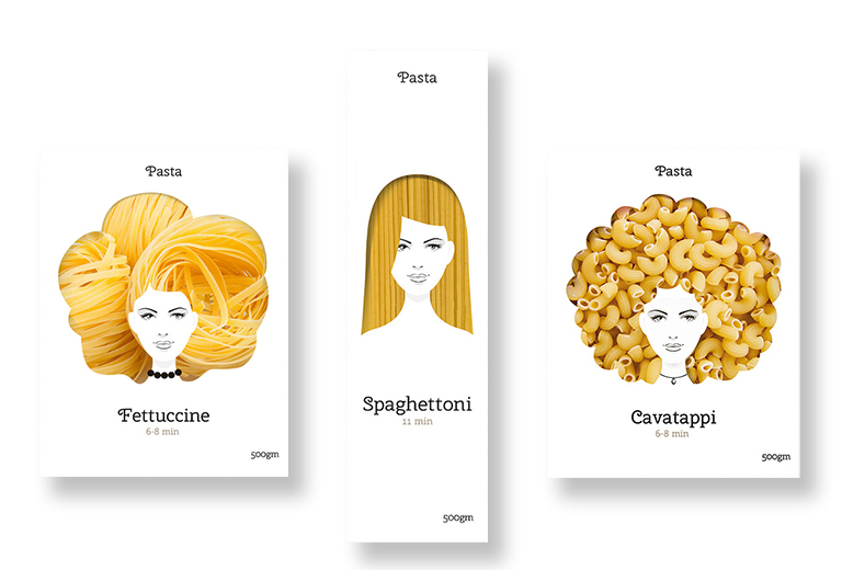
Why try to describe the product with images and words, when you can die-cut the package and give shoppers a peek inside? Especially when it comes to pasta noodles, it is helpful to see what the actual noodles look like instead of trying to recall the difference between fettuccine, rigatoni, vermicelli, macaroni, etc. This concept packaging by Moscow-based designer Nikita Konkin used the different shapes and textures of pasta noodles to create silhouettes of fanciful hairstyles in the die-cut windows. The noodle hairstyles framed a simple one-color line drawing of a woman’s face in a memorable and playful way.
Read More »


